Start with Nevada.
The places and traditions people recognize became the starting point for the names and artwork, from desert trails to nights at the ballpark.
A brewery’s roots.
A clearer expression.
Tenaya Creek has been brewing in Las Vegas since 1999. I saw an opportunity to bring its connection to Nevada into sharper focus, using the region’s landscapes, wildlife, weather, and local traditions to guide the brand.
The goal was a recognizable family of beers, with enough room for each label to tell its own story. That direction shaped the naming, packaging, and applications across the wider identity.
The places and traditions people recognize became the starting point for the names and artwork, from desert trails to nights at the ballpark.
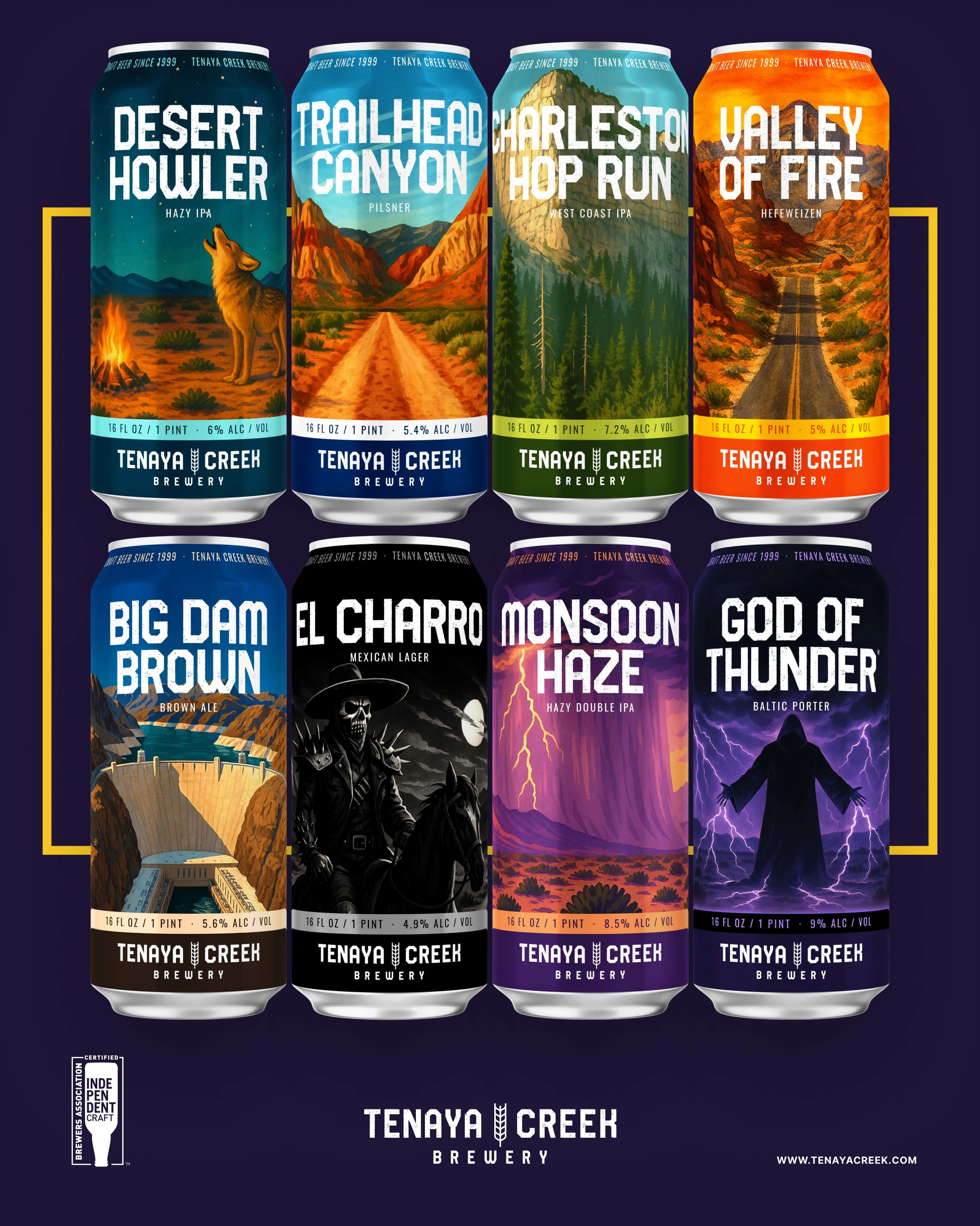
Each beer has a specific source of inspiration. Its name, illustration, and color palette bring that story into focus.
Consistent typography, information placement, and brewery branding connect the labels, while each illustration has room for its own character.
Nine designs, with a closer look at the choices behind their color, composition, and character.
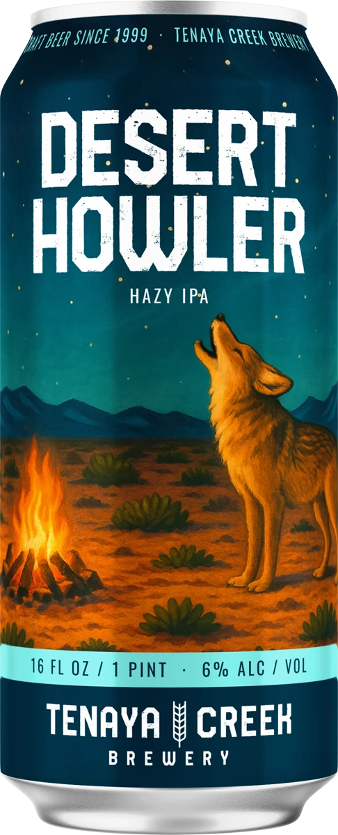
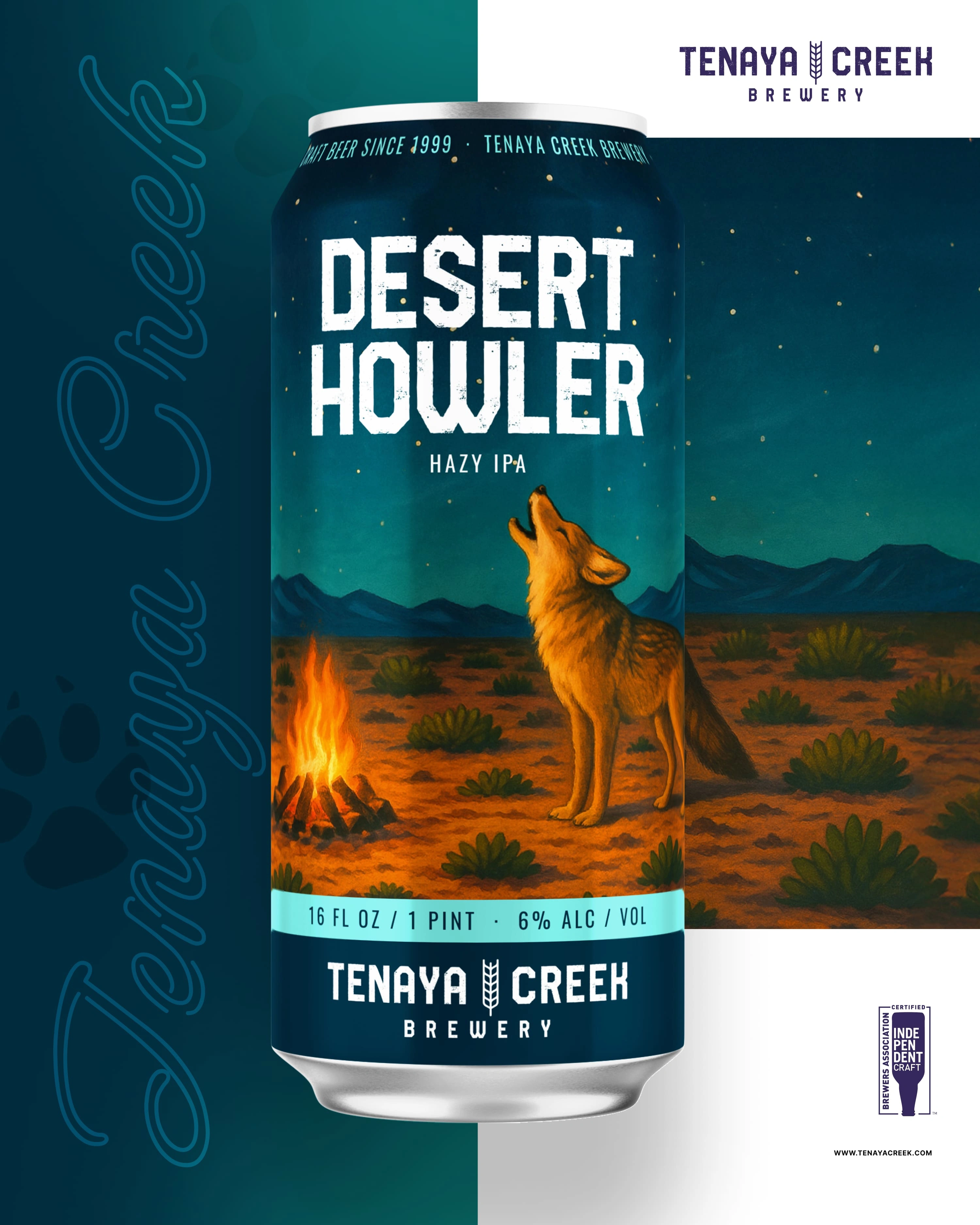
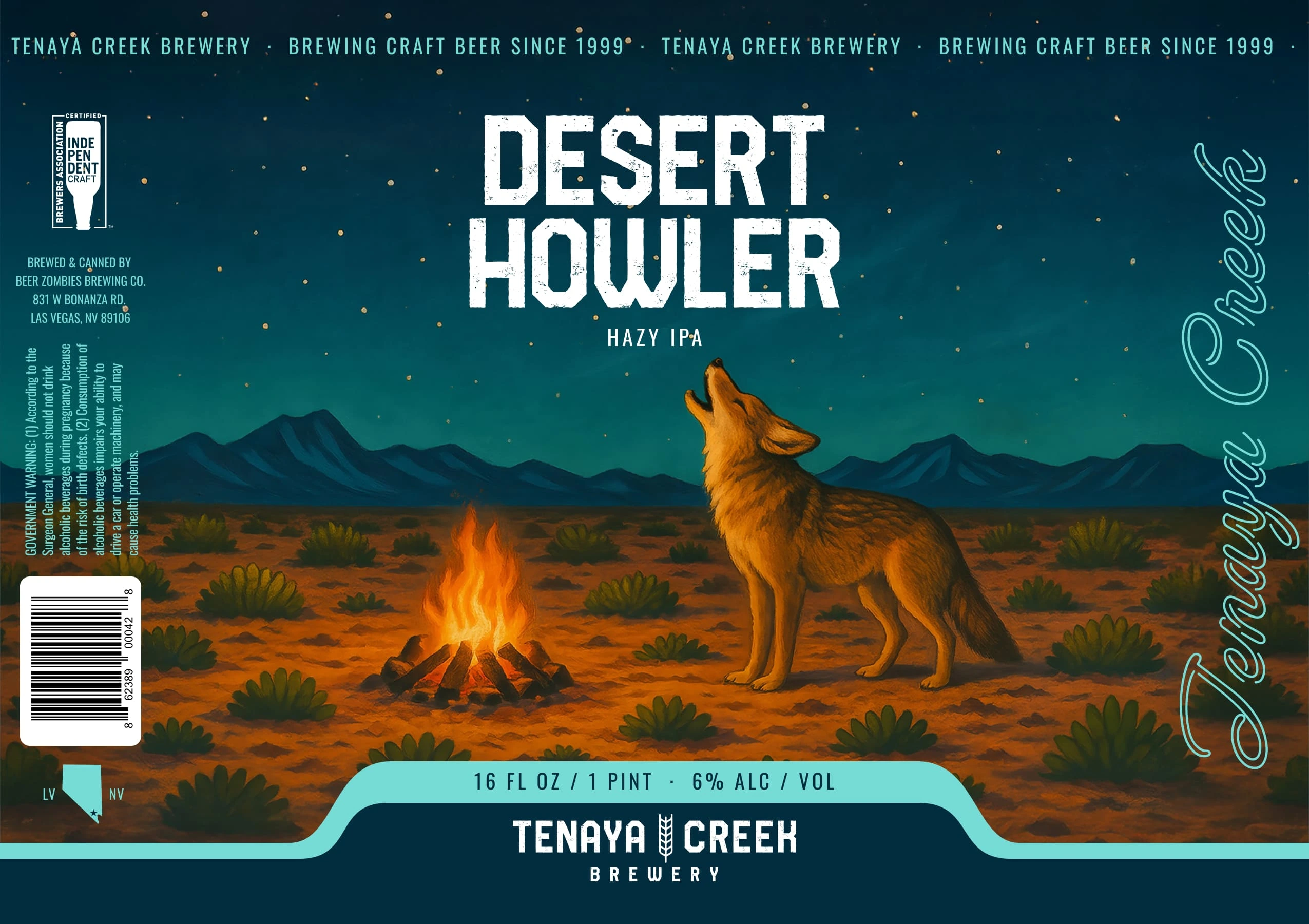
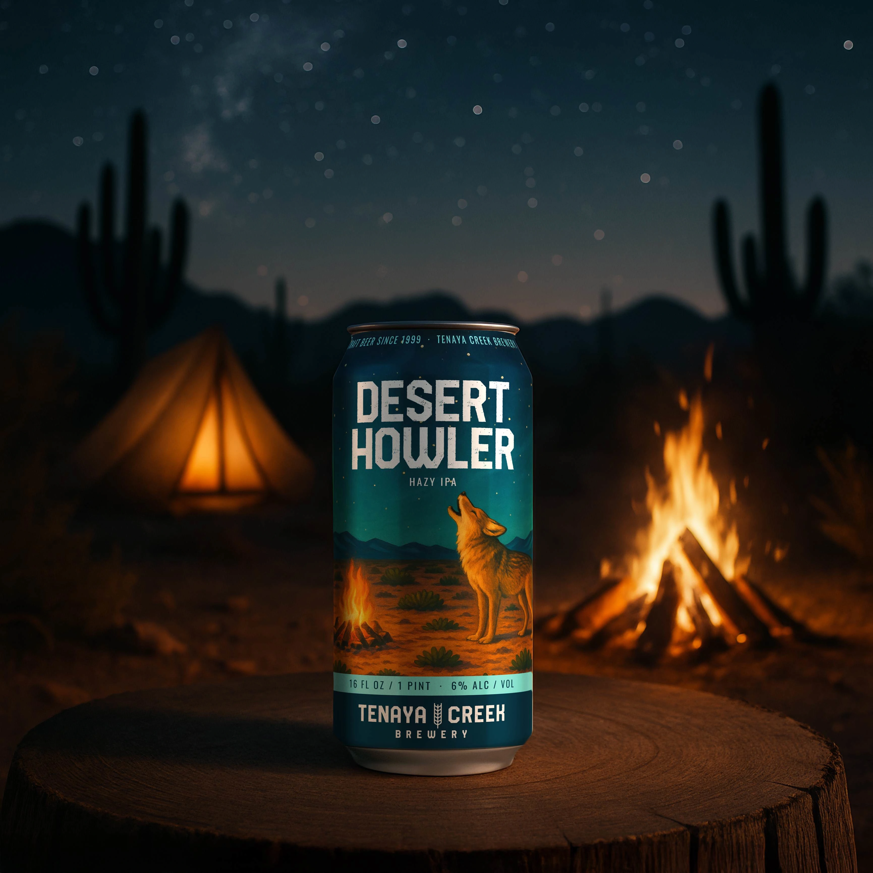
The warm glow of a campfire contrasts with a deep blue desert night. The coyote gives the scene a clear focal point and the label a personality of its own.
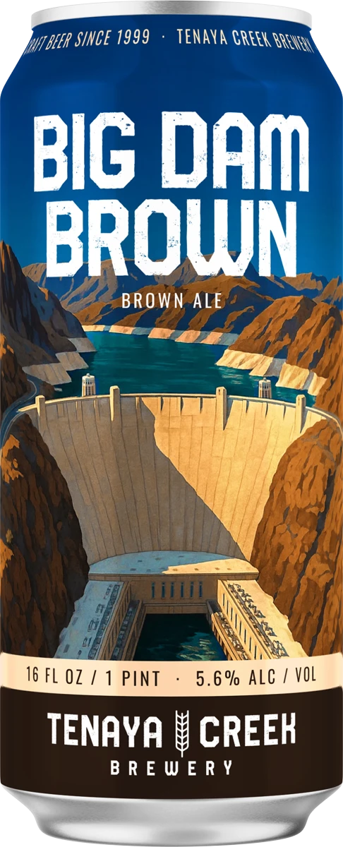
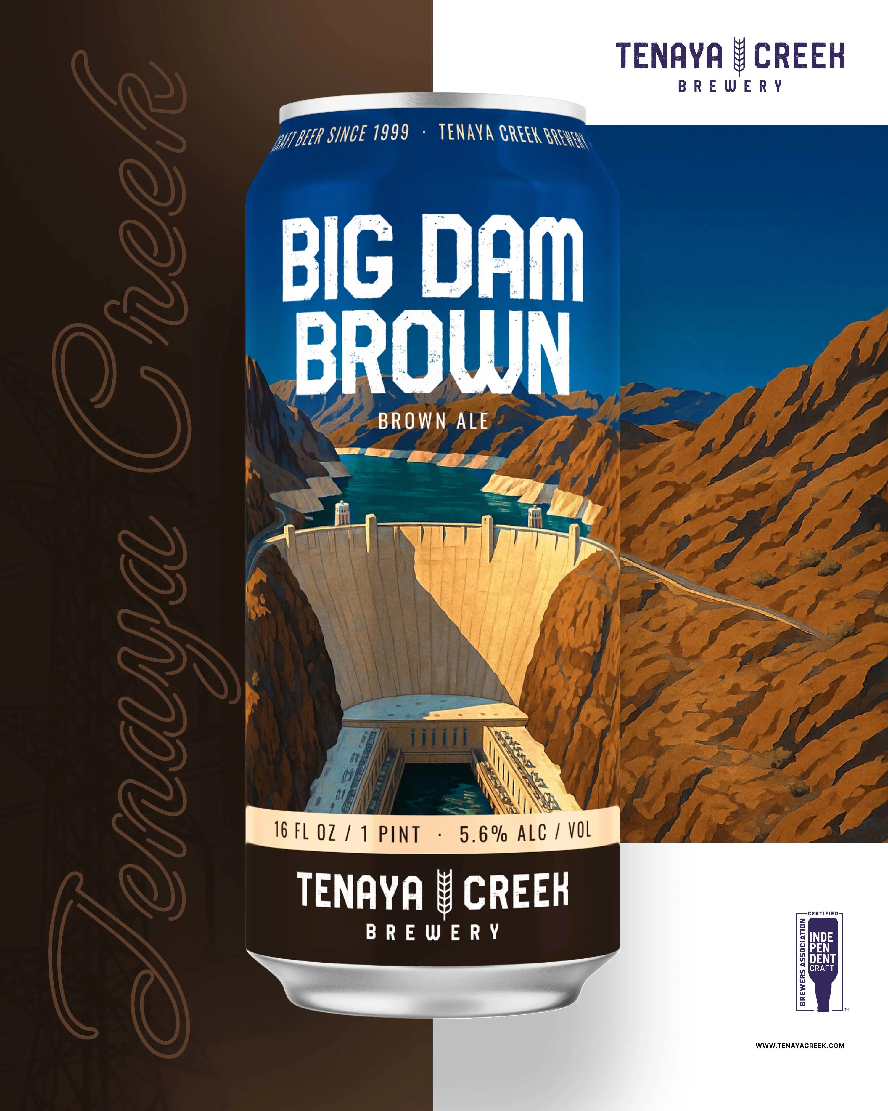
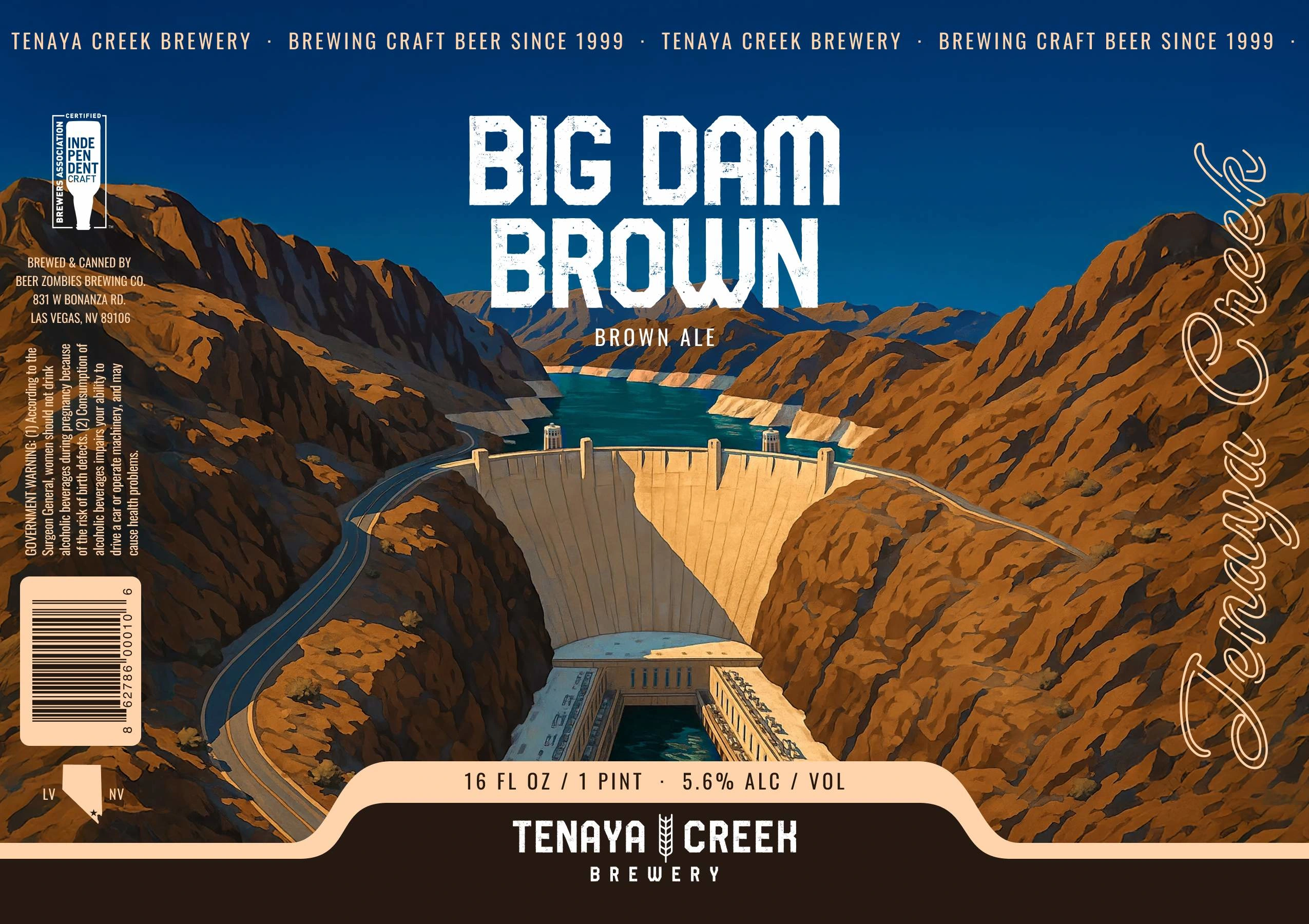
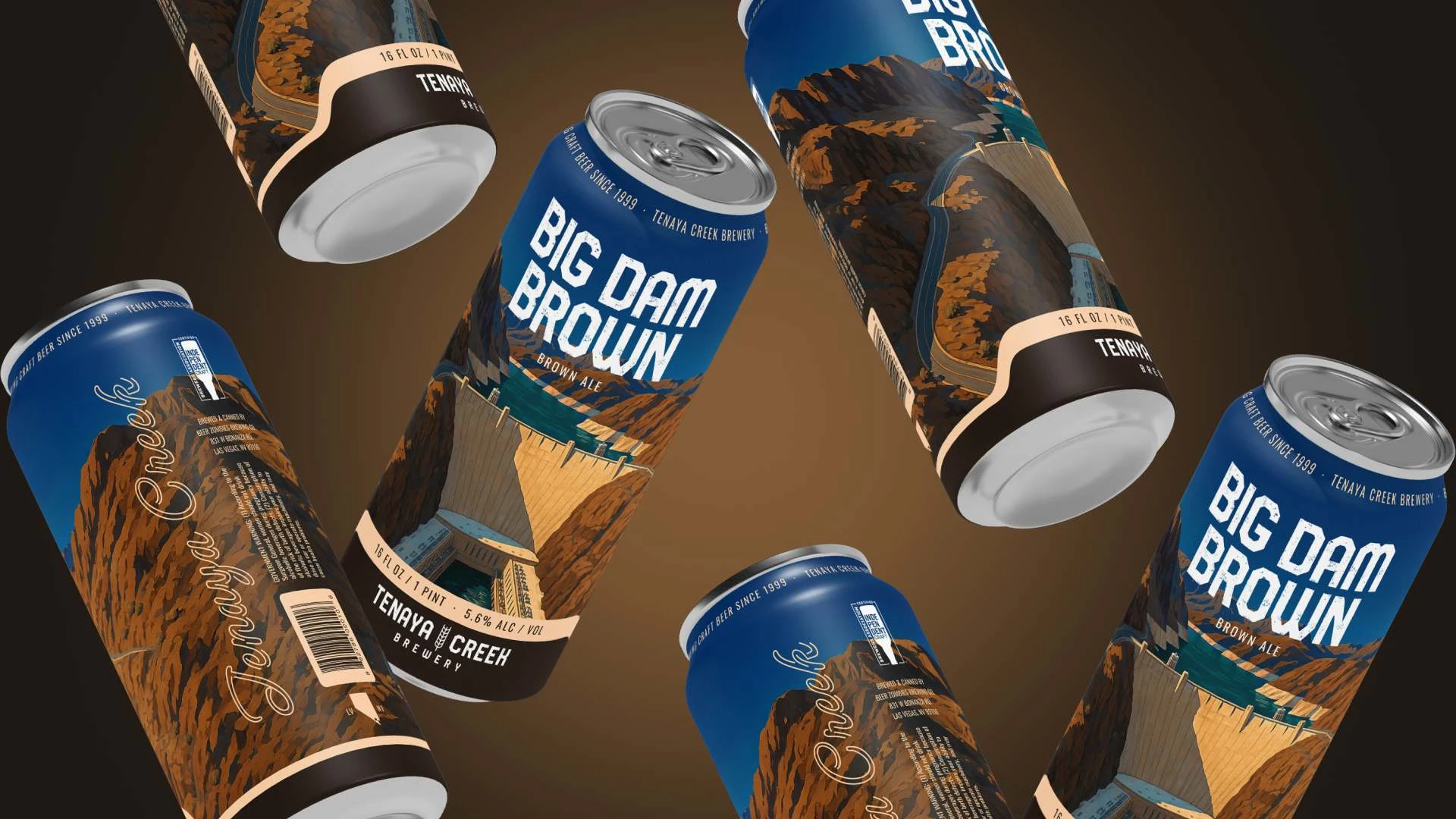
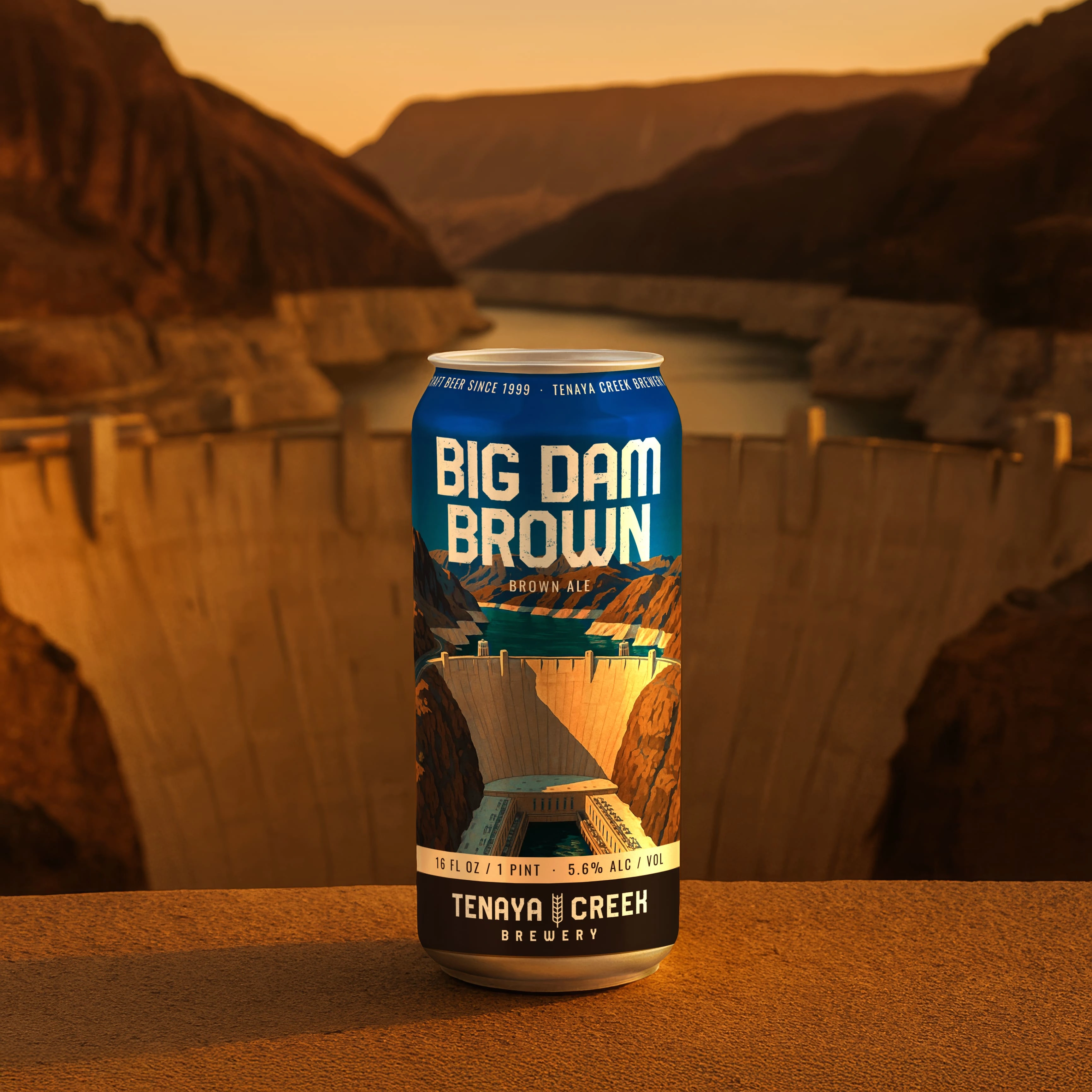
Hoover Dam anchors the composition, framed by canyon walls and water. The illustration gives the landmark room to lead while keeping the beer name clear and prominent.
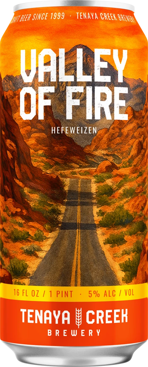
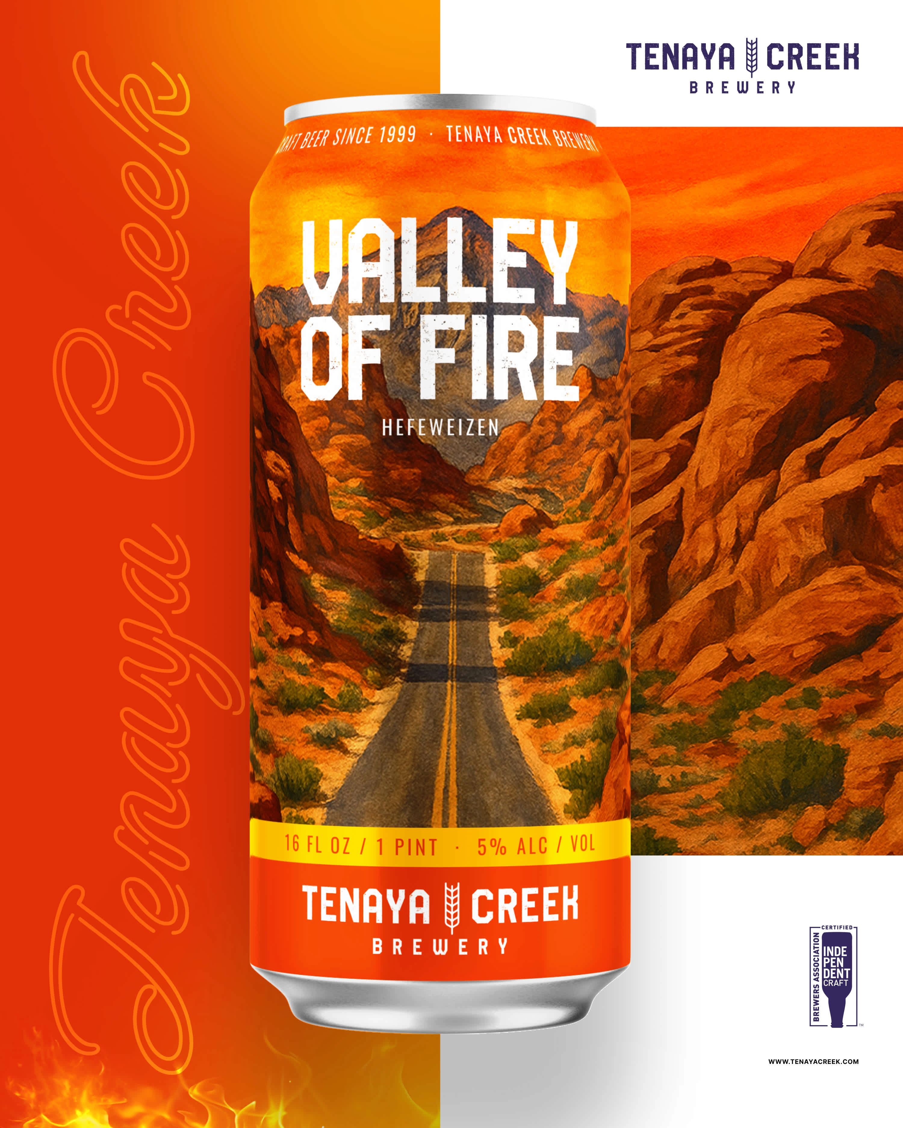
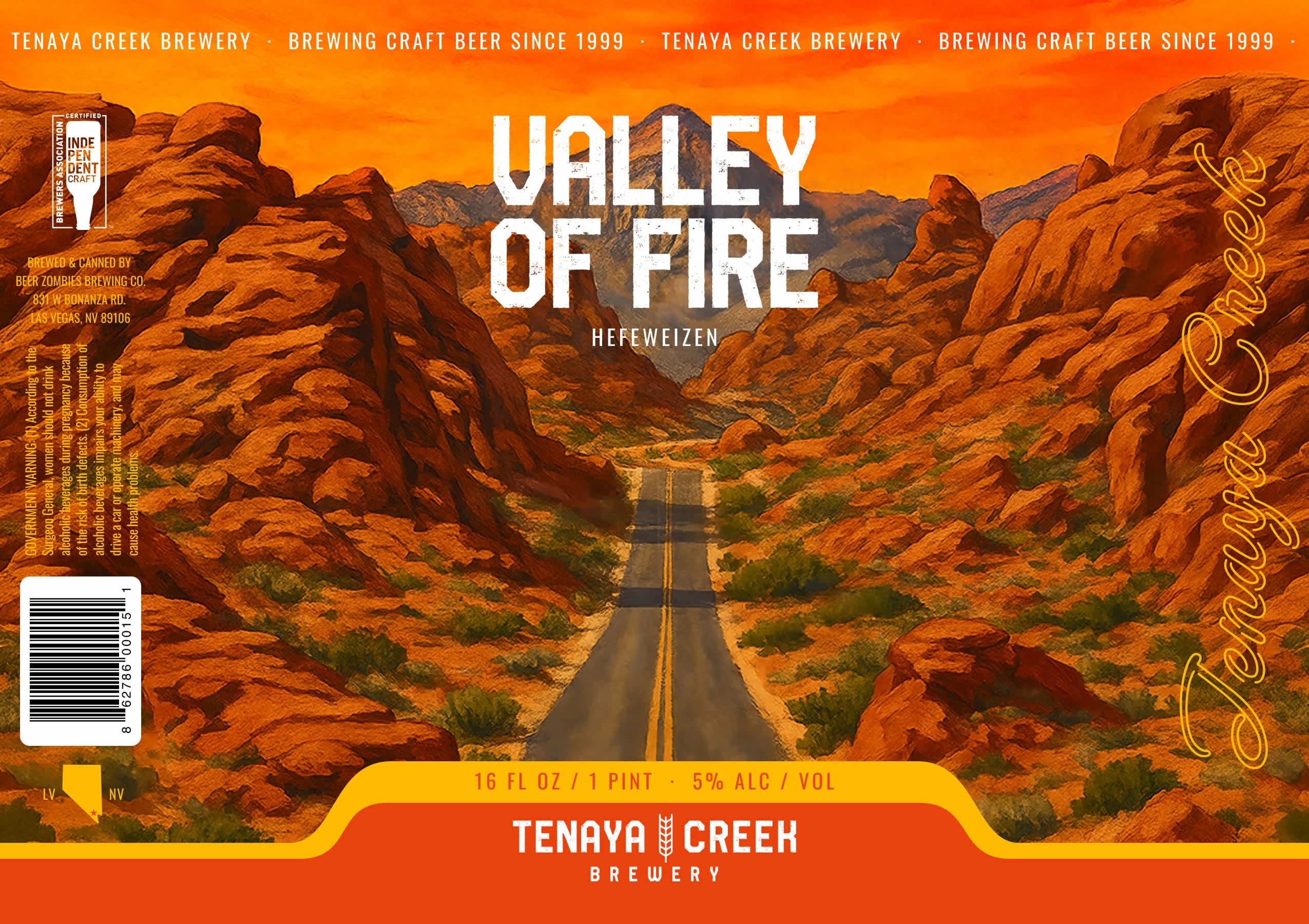
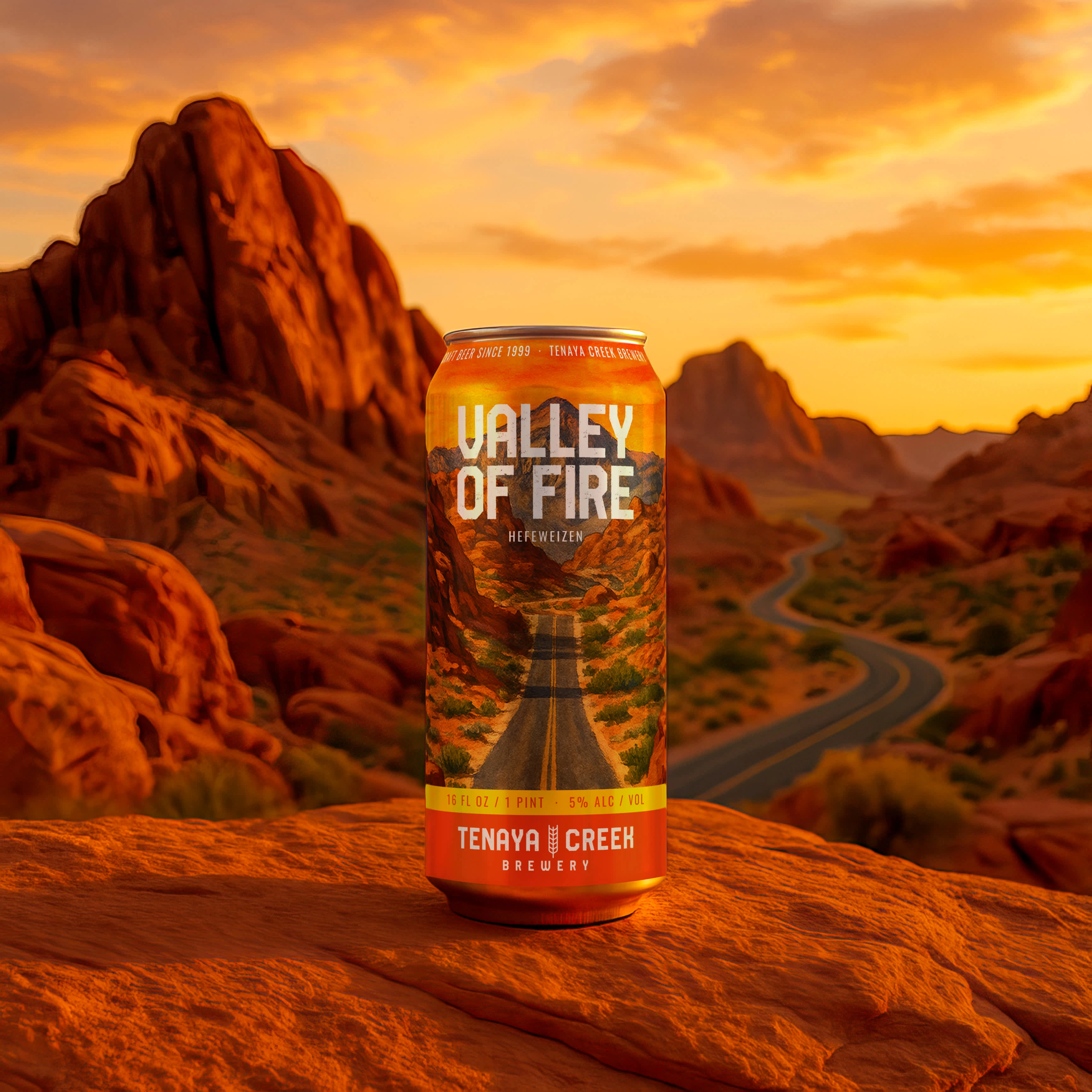
Orange and gold distinguish Valley of Fire within the lineup. The palette comes from the sandstone landscape and gives the hefeweizen a character of its own.
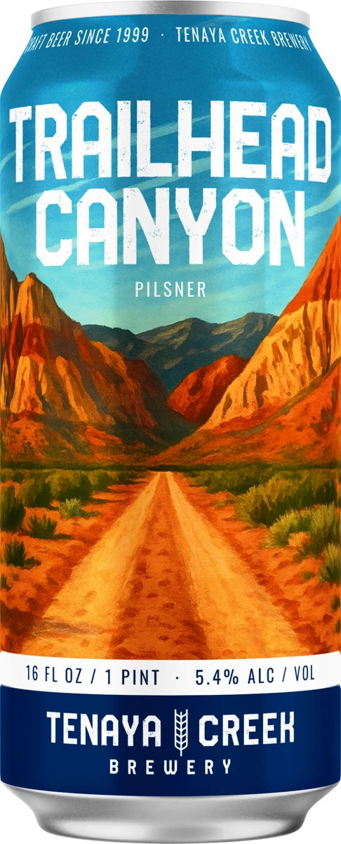
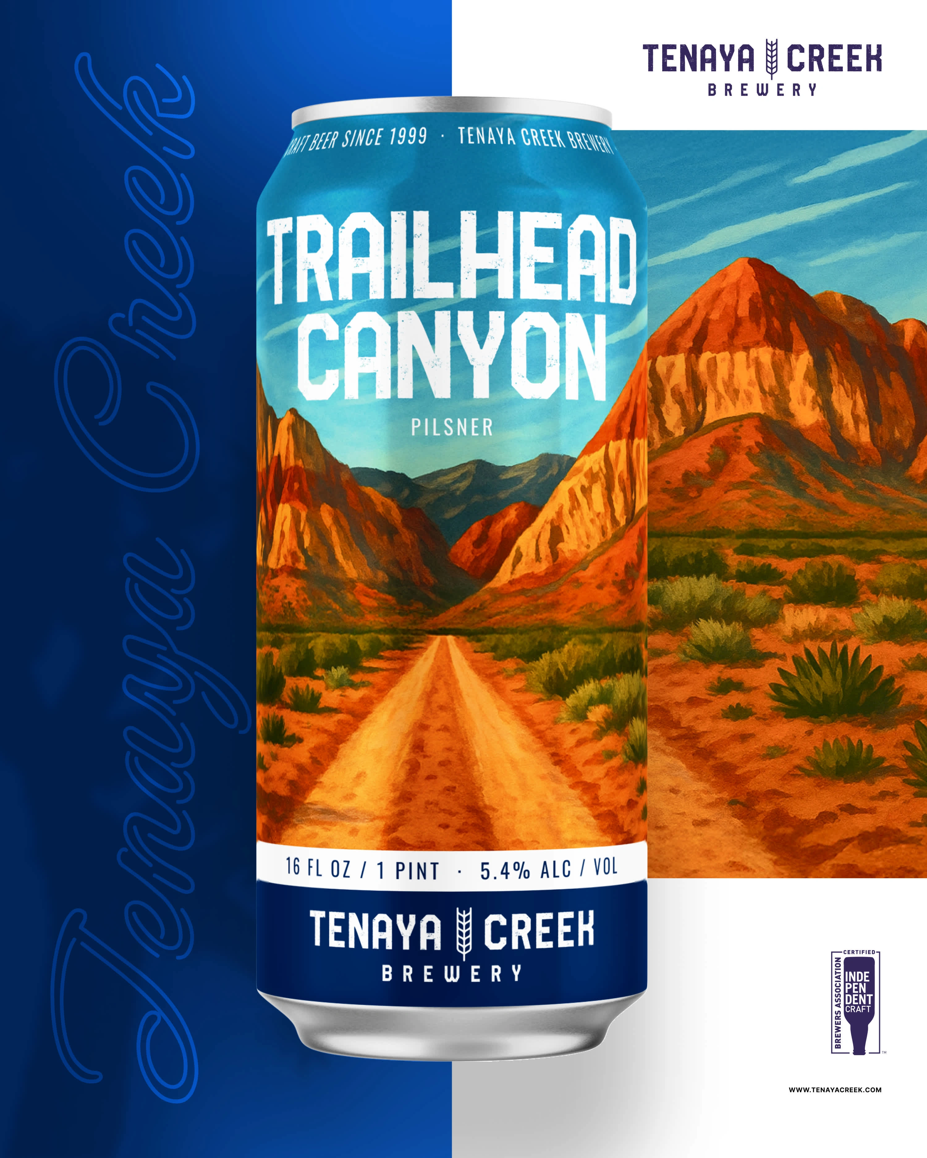
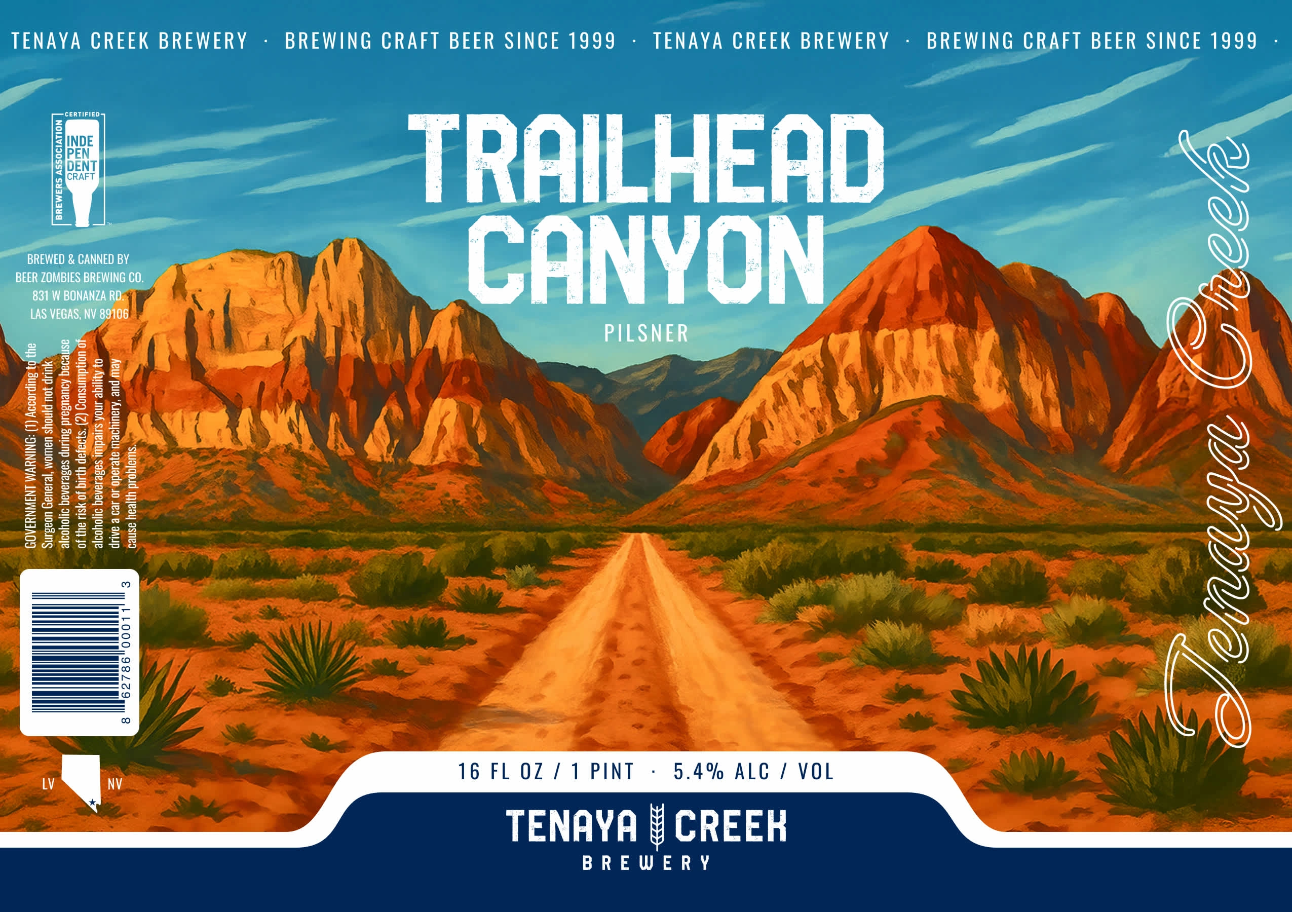
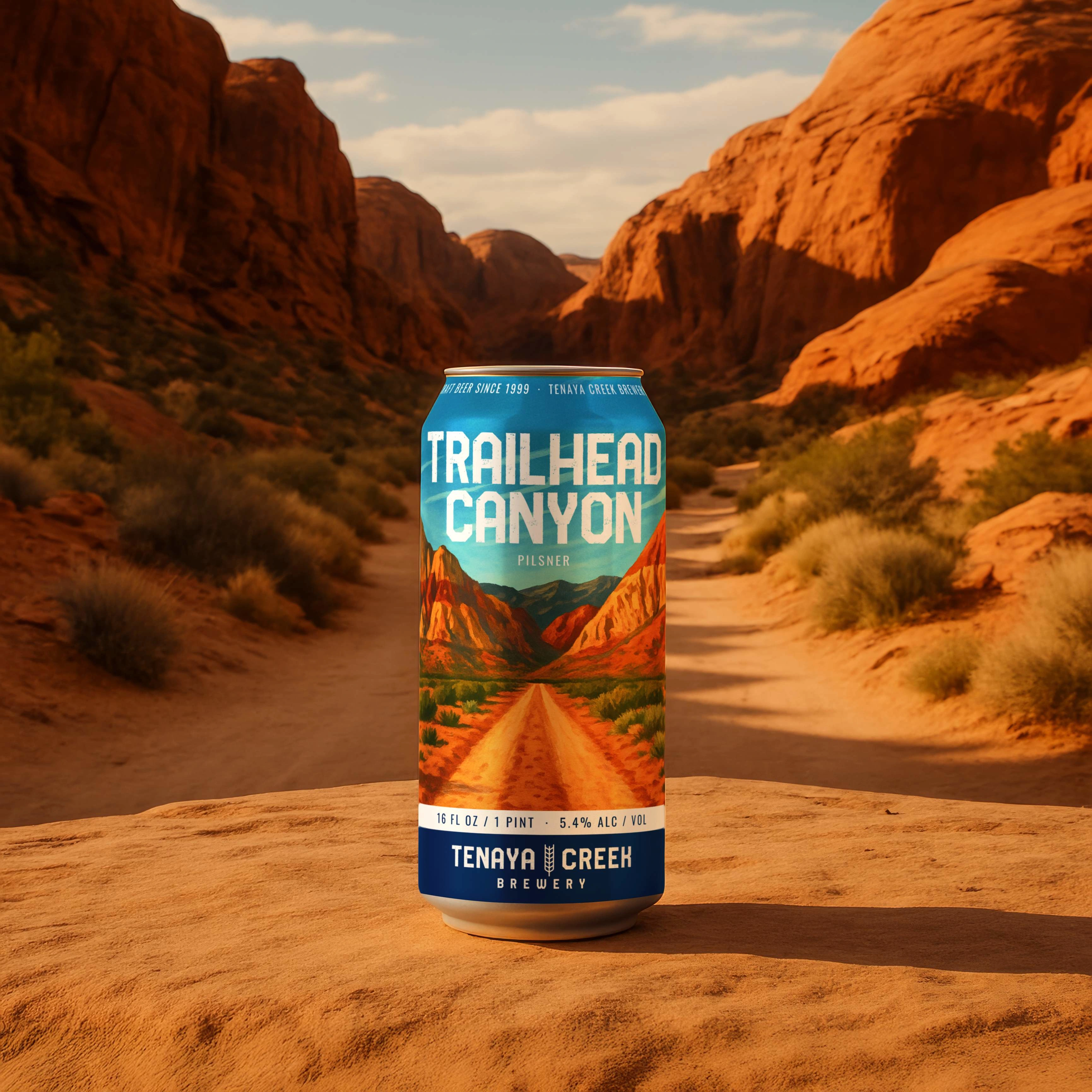
A dirt road leads into the center of the canyon, drawing the eye through the scene. The composition gives the label depth and a sense of exploration.
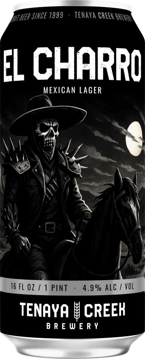
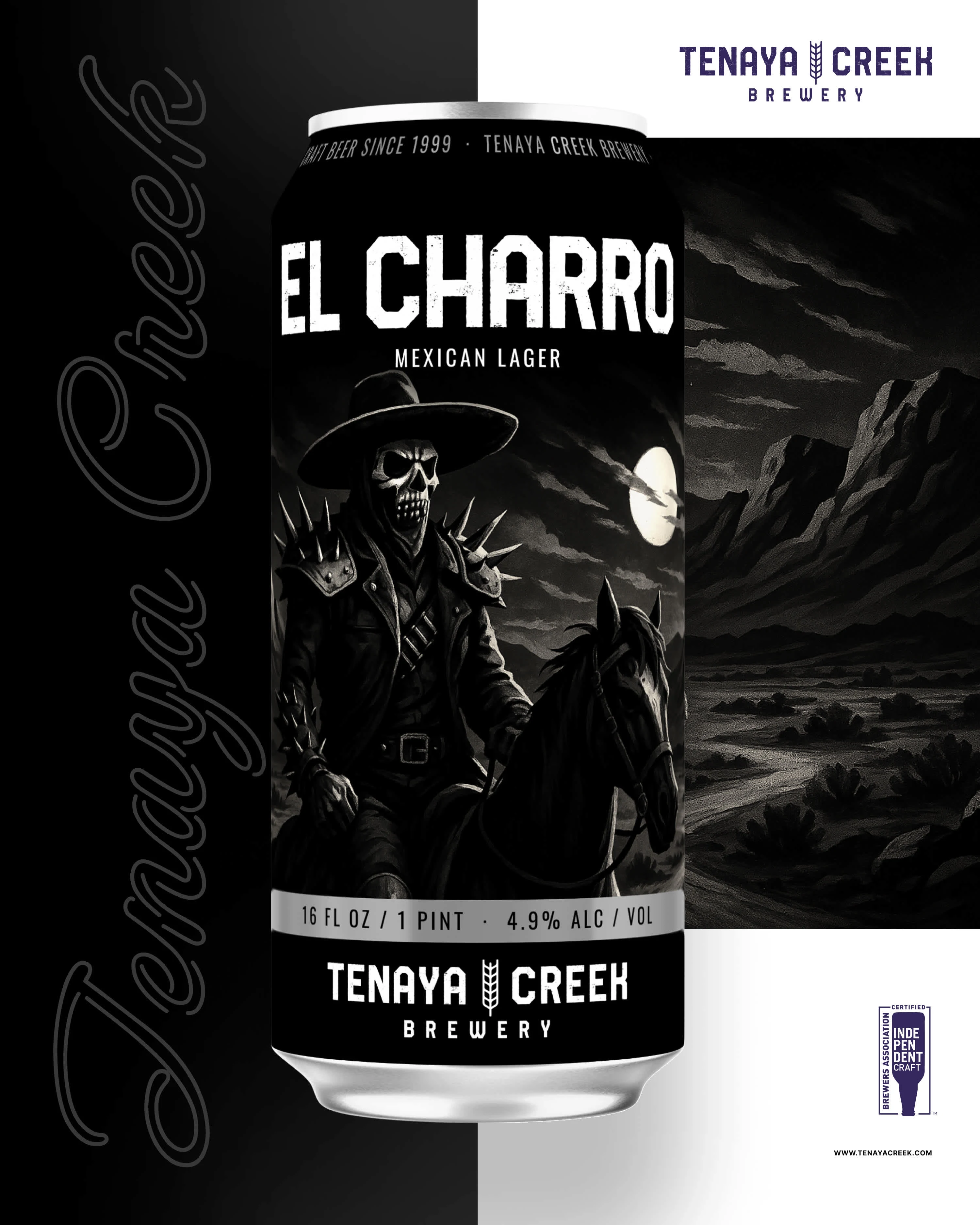
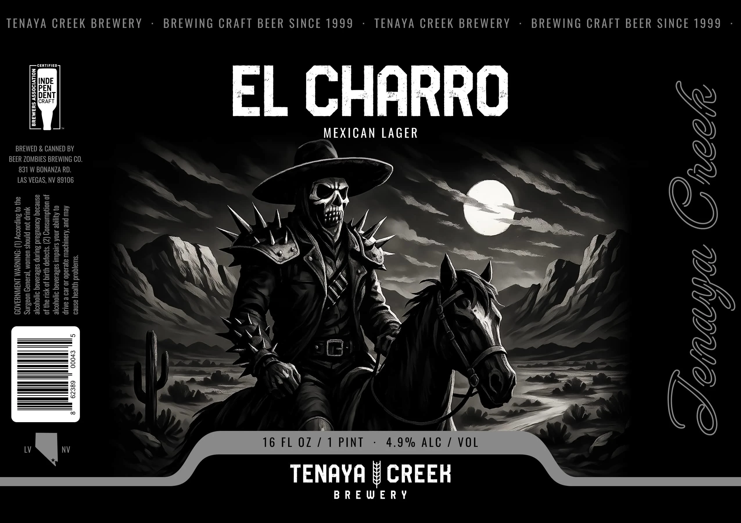
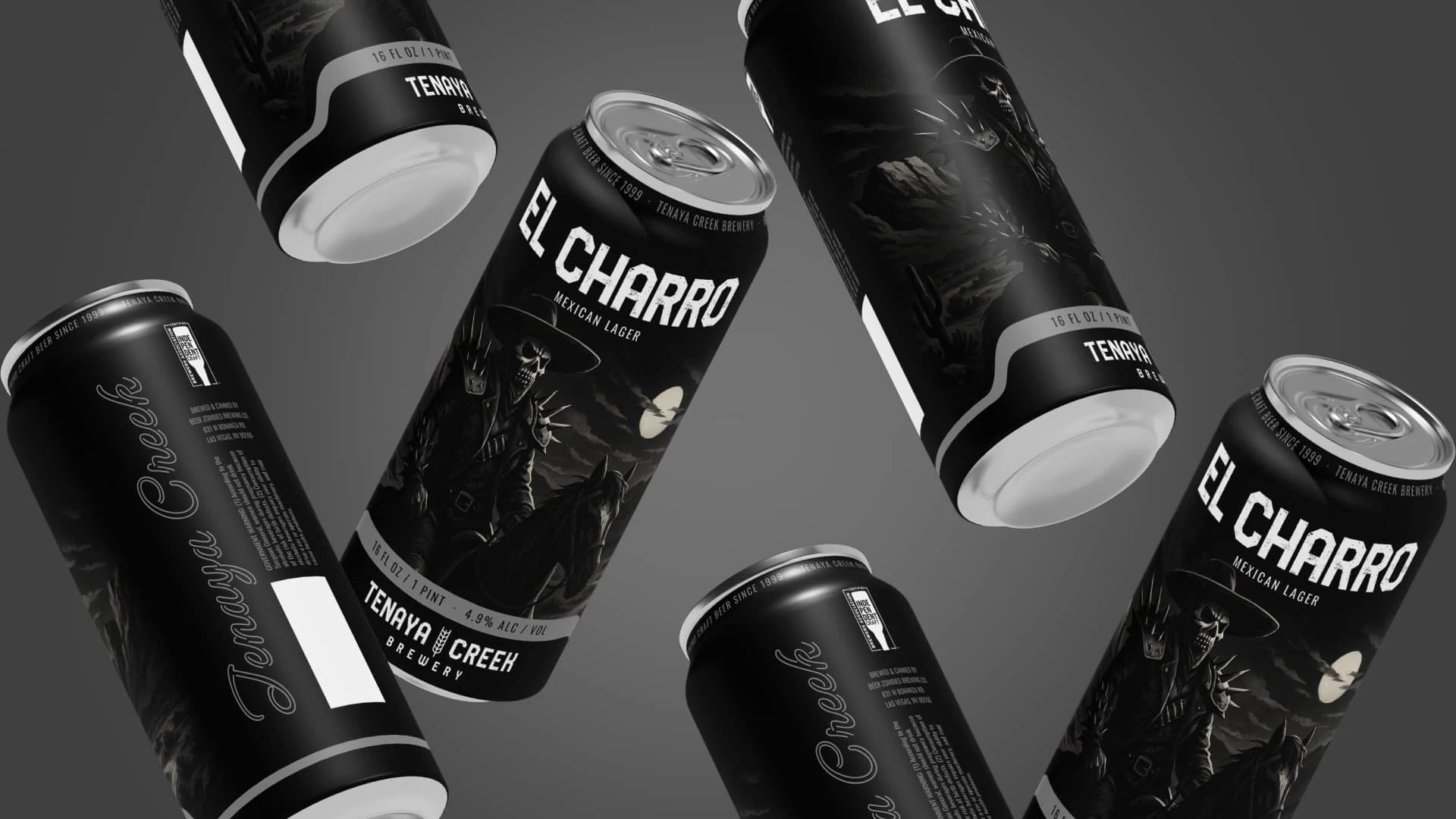
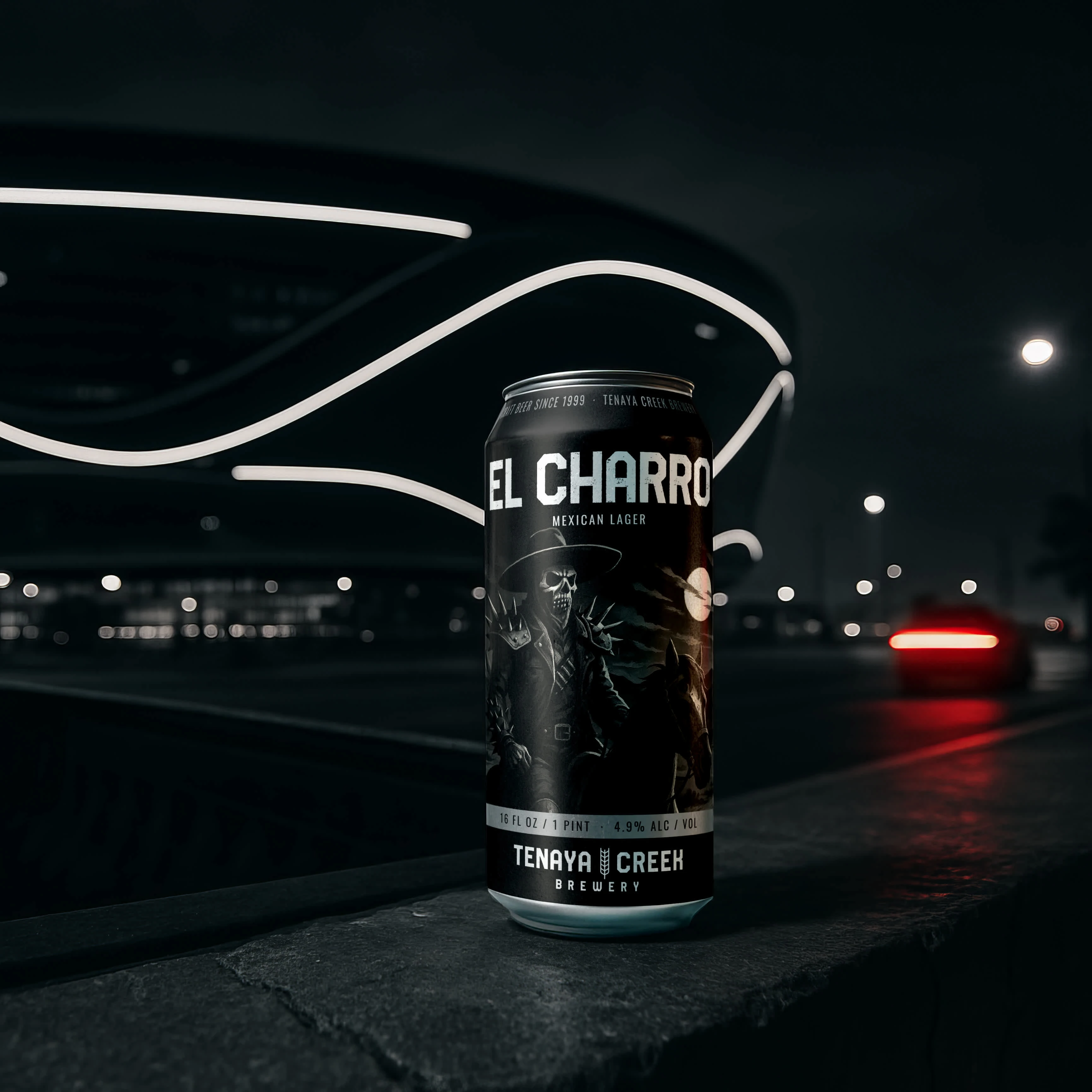
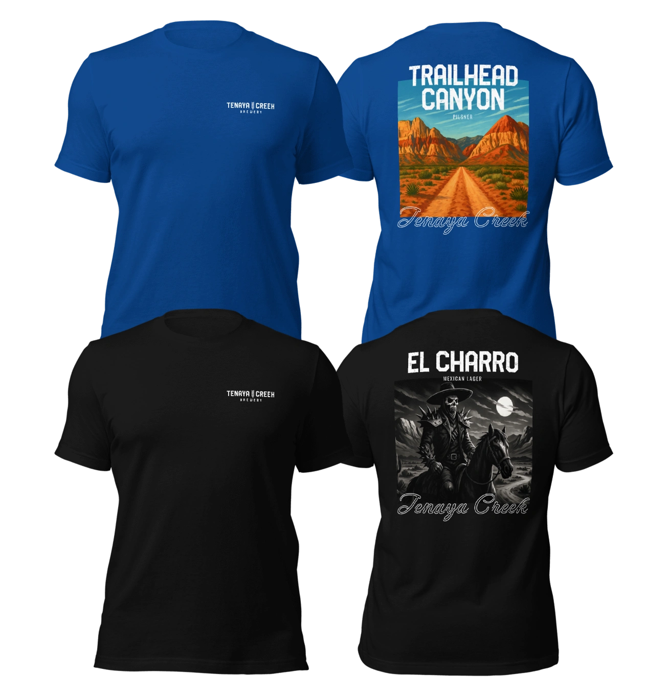
Black and silver give the skeletal horseman a sharp silhouette against the moonlit landscape. The restrained palette sets the label apart while keeping the beer name easy to read.
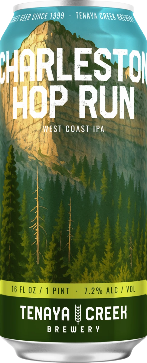
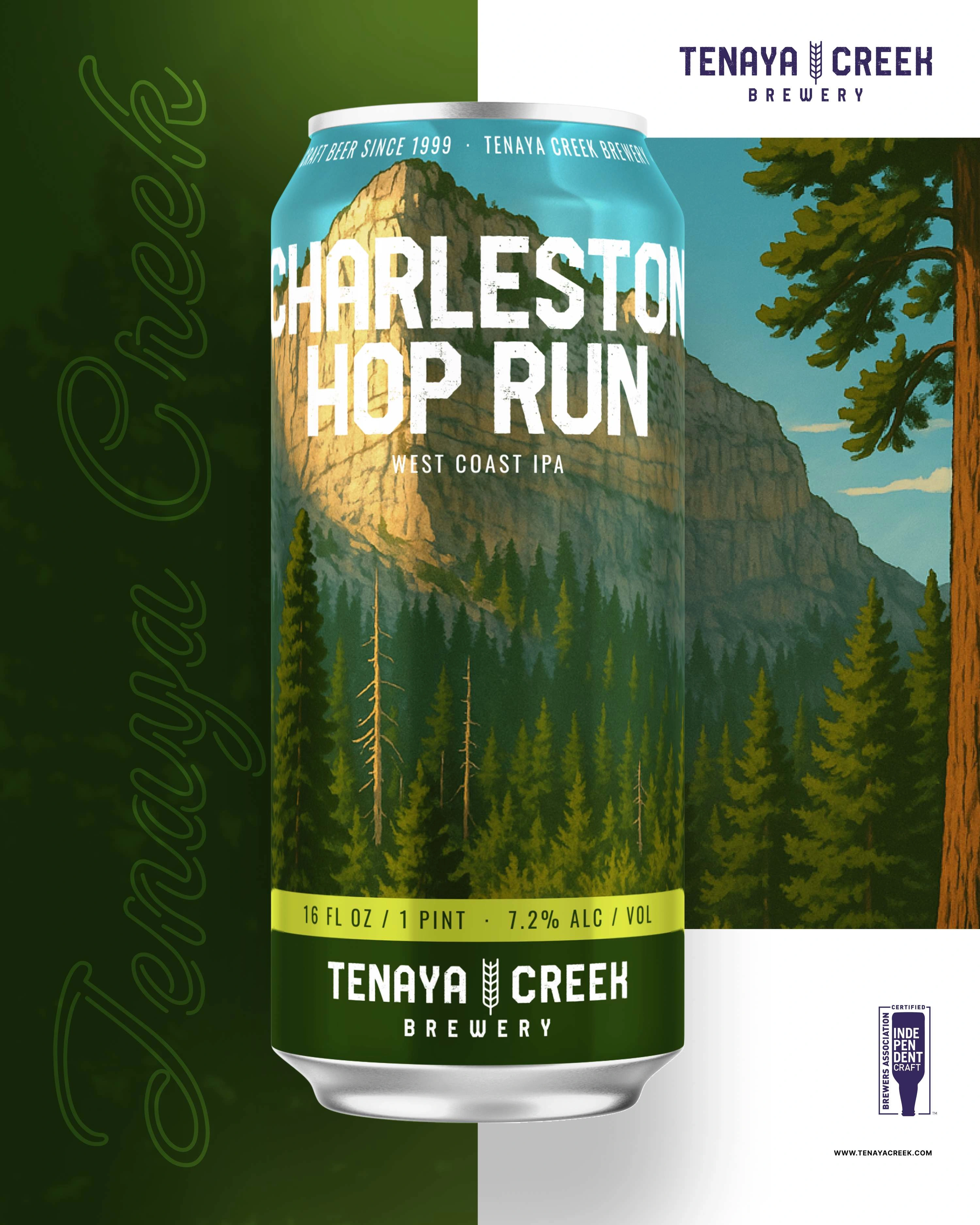
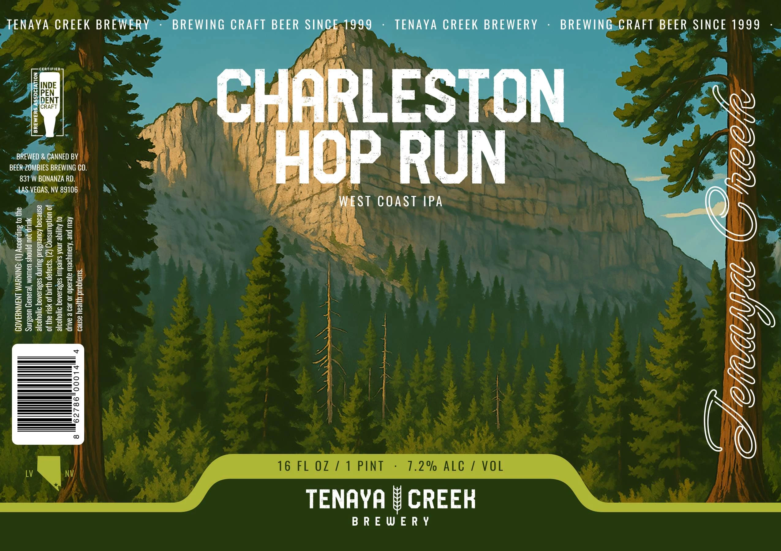
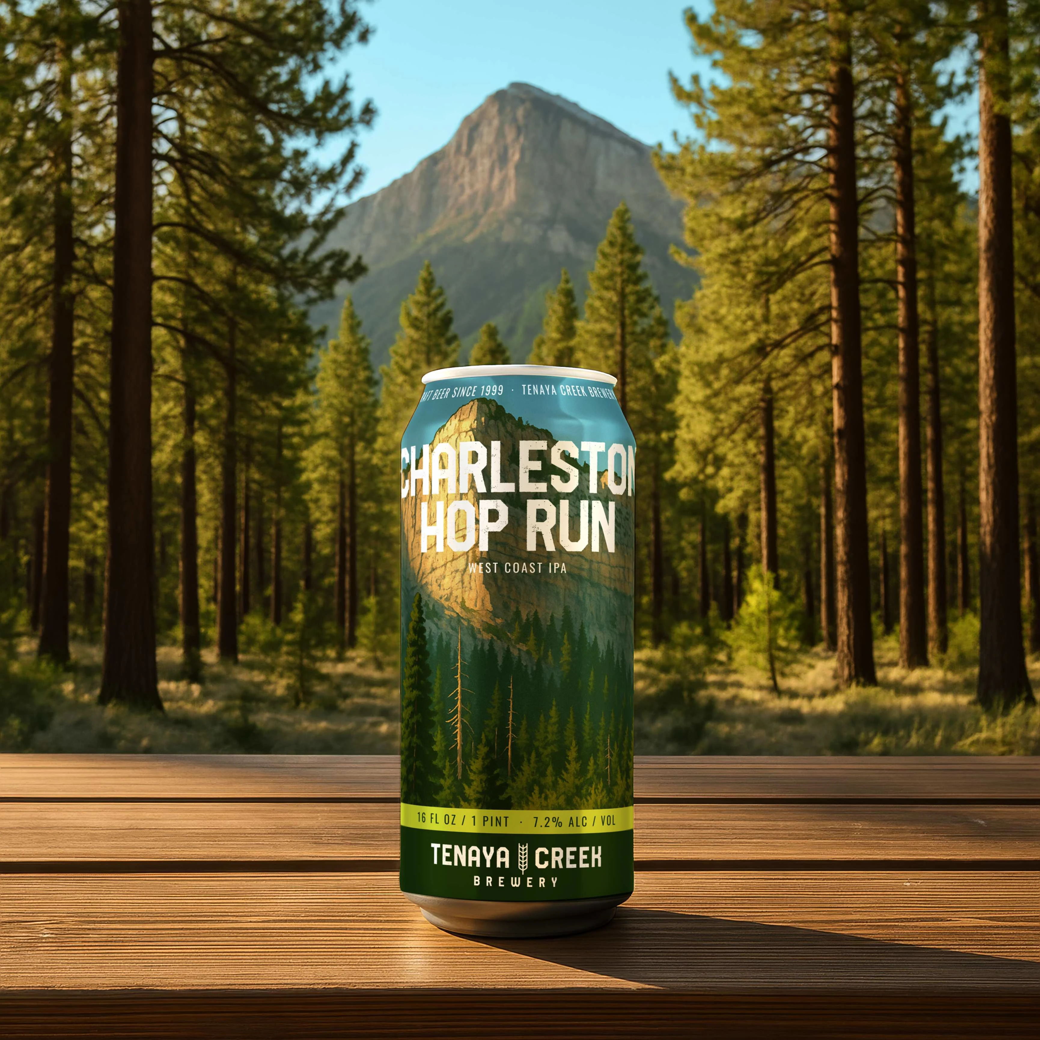
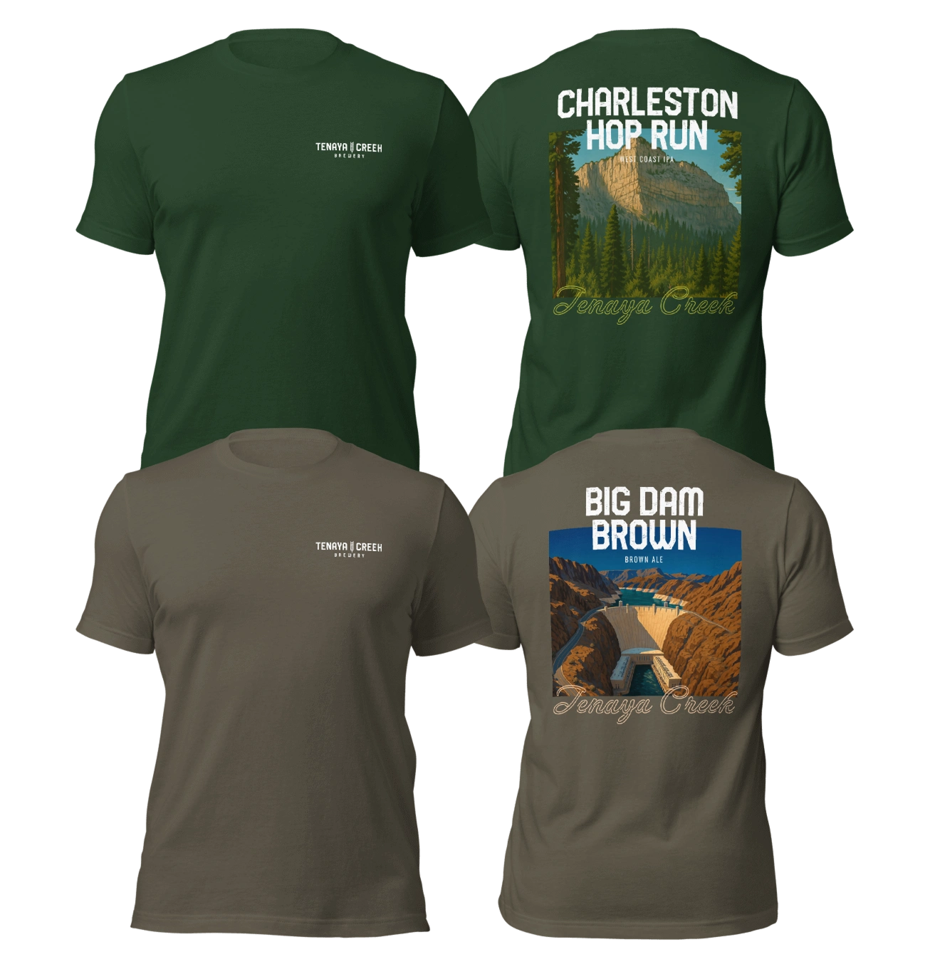
Pine trees frame the limestone cliffs, creating depth from the foreground to the mountain beyond. Forest greens and a clear blue sky give the label a cooler character within the collection.
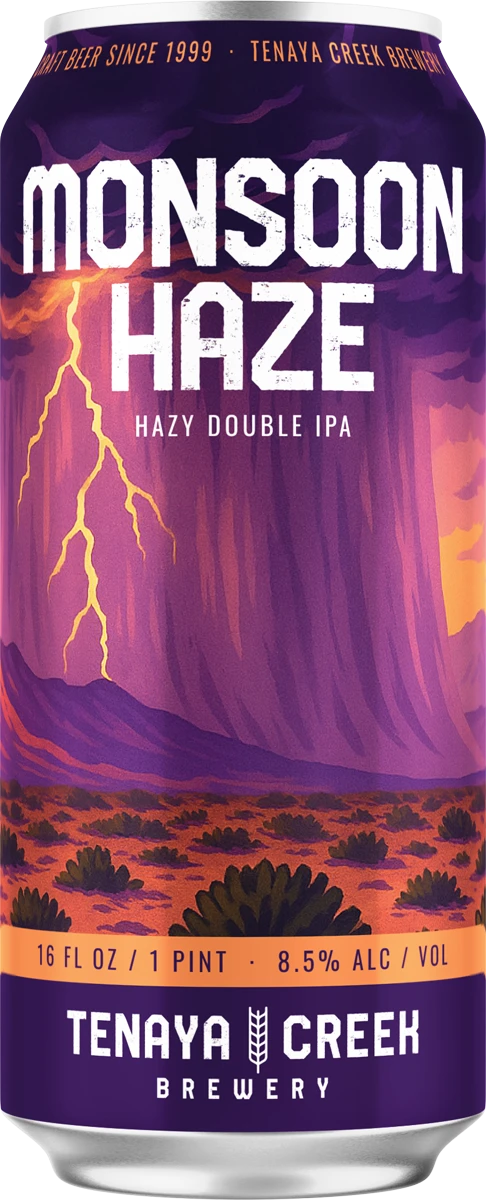
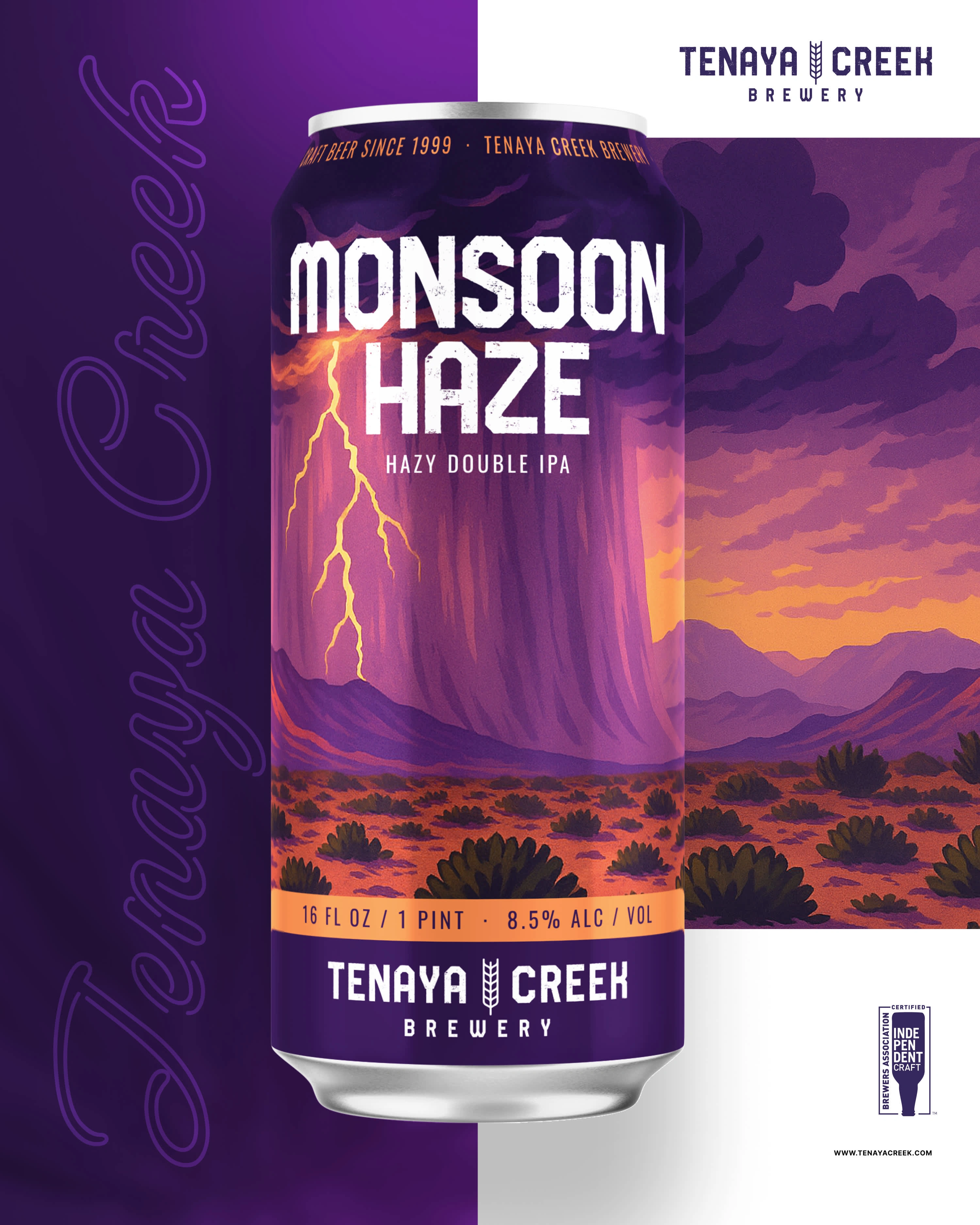
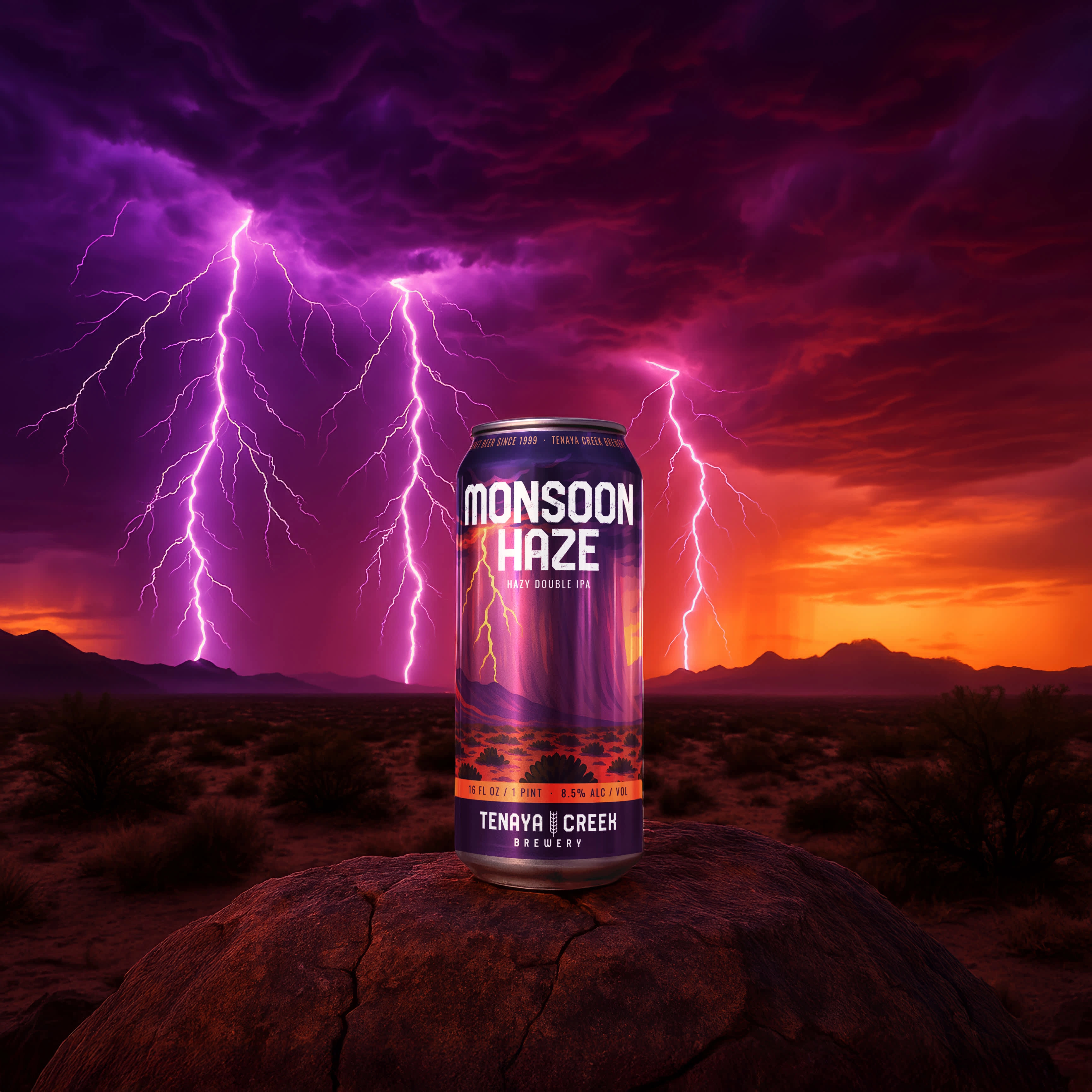
A flash of lightning cuts through violet clouds above the warm desert floor. The contrast between sky and landscape gives the label energy and keeps the storm at the center of the composition.
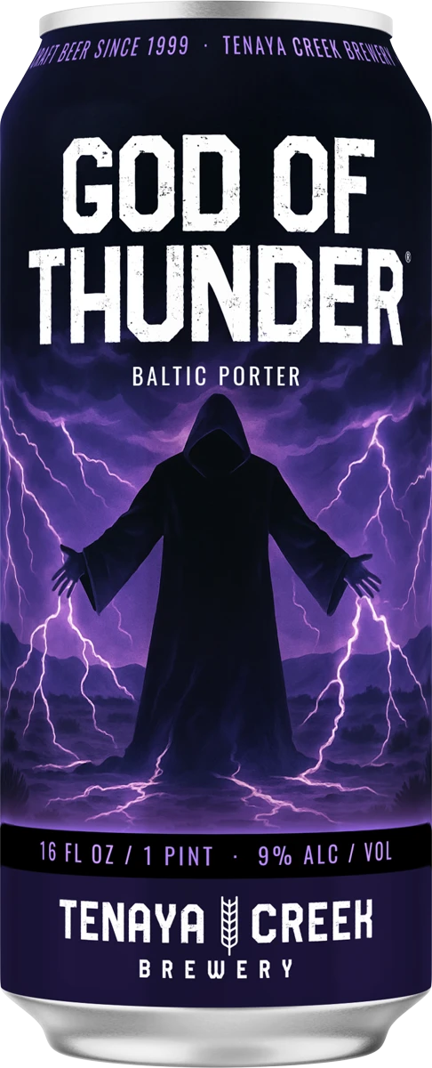
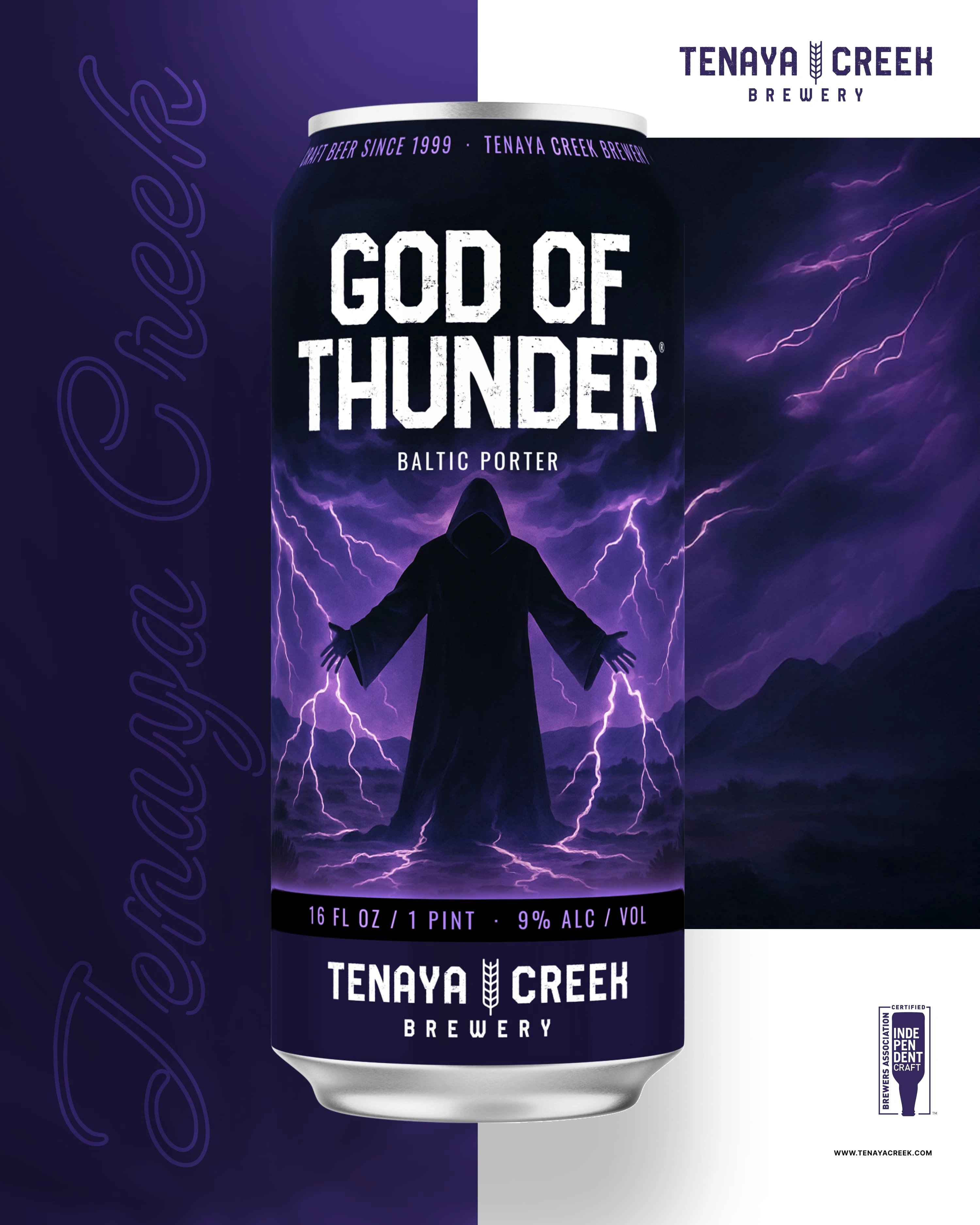
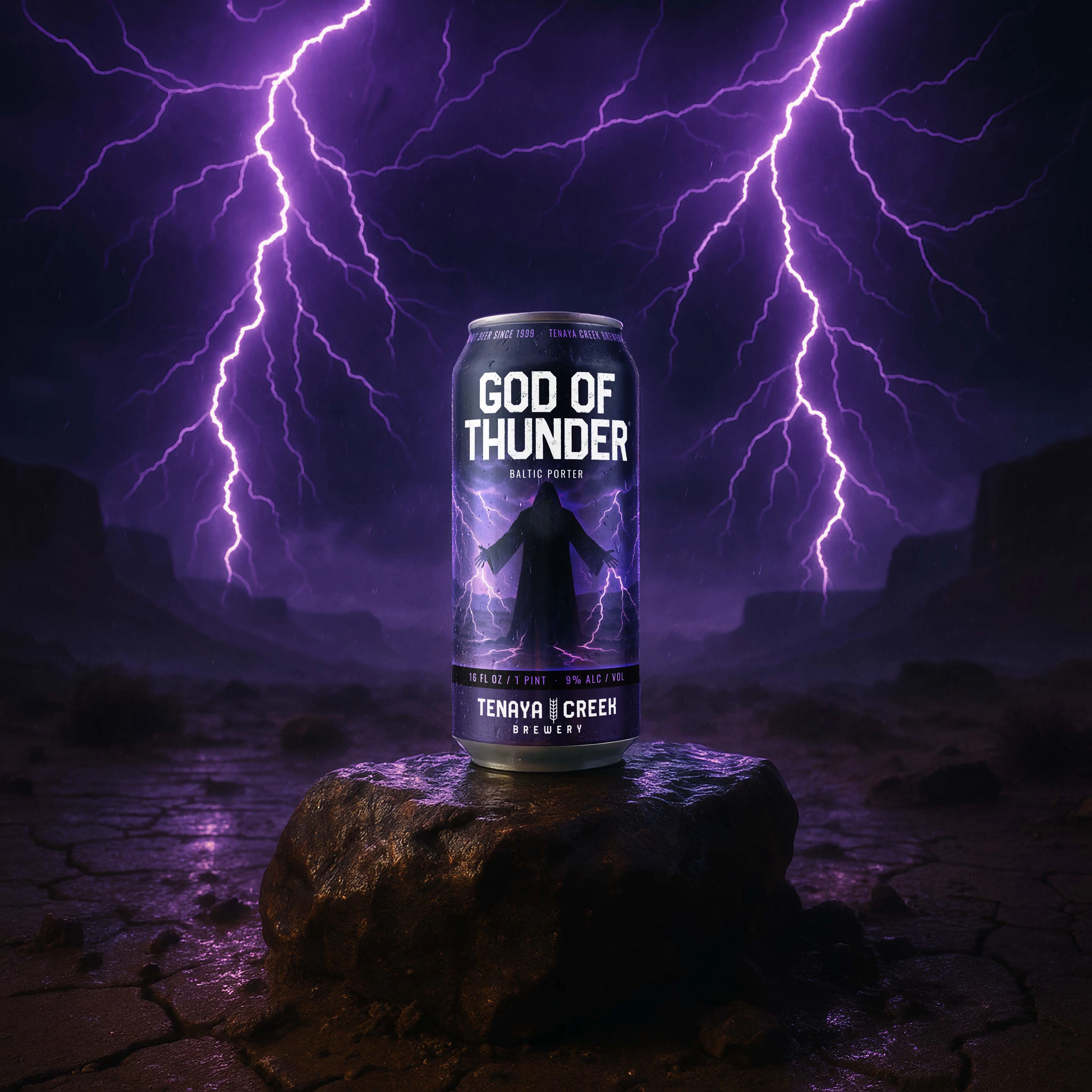
A dark, hooded figure stands against electric violet lightning. Its simple silhouette creates a strong focal point, while the storm gives the label movement and atmosphere.
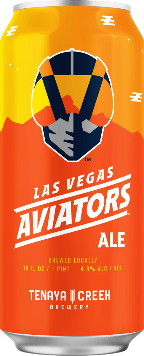
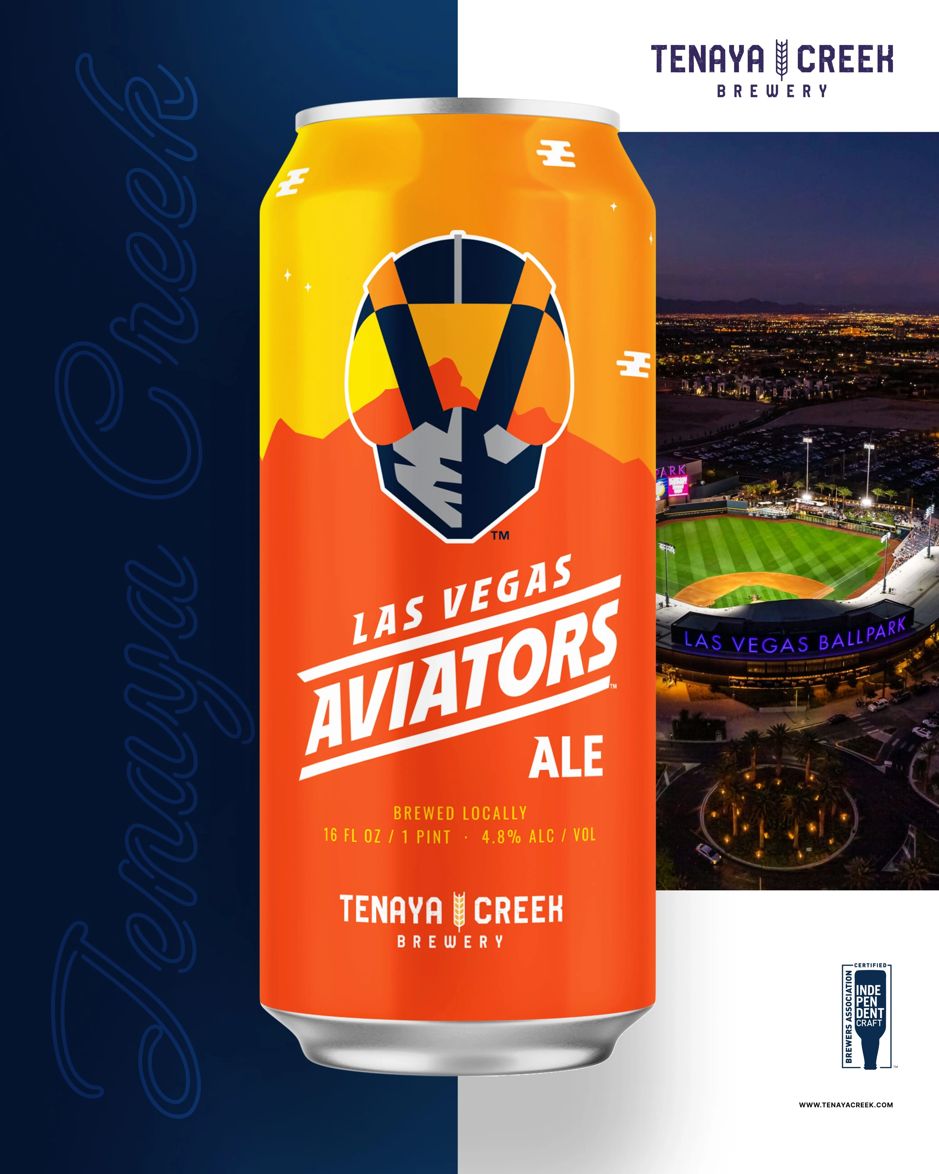
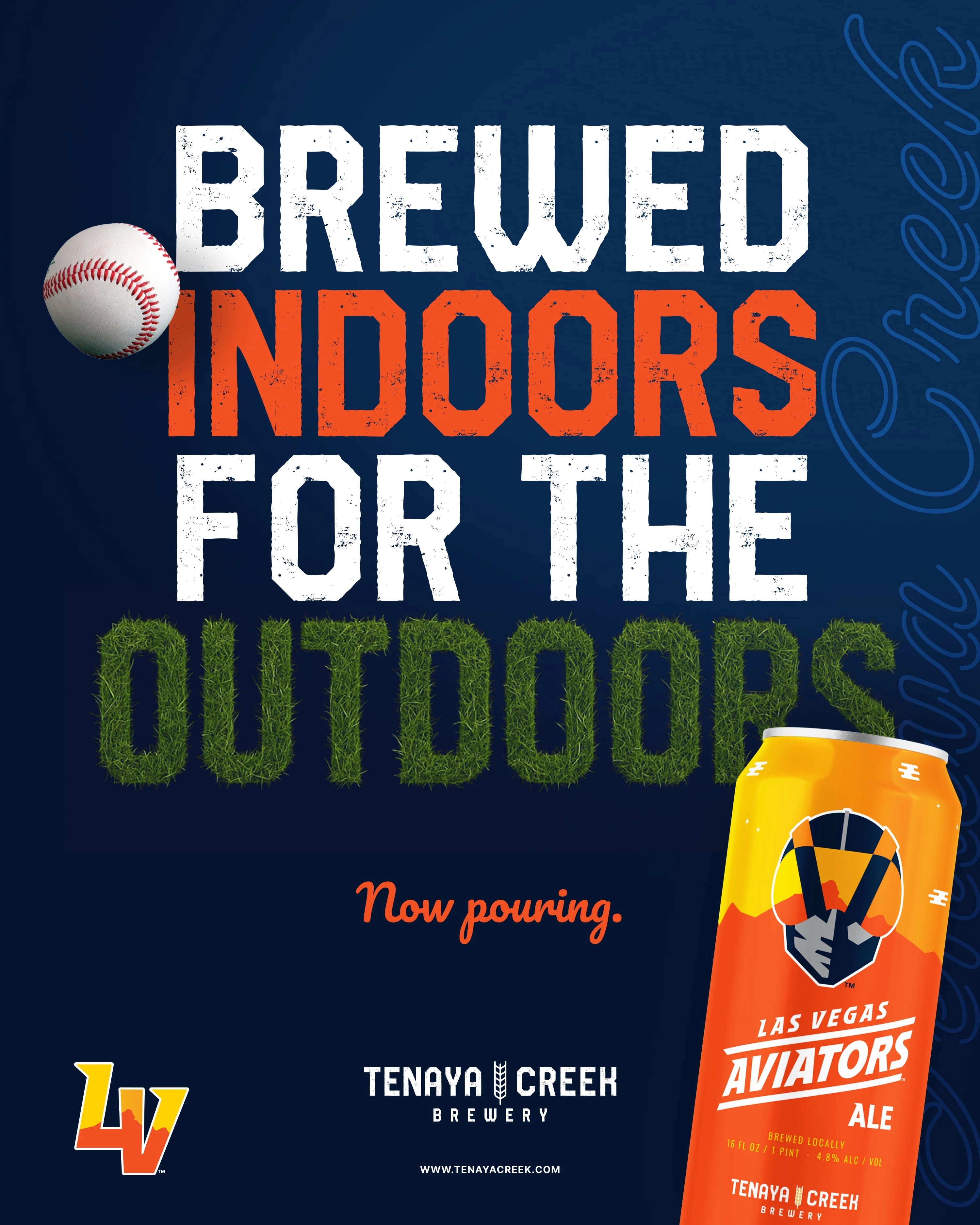
The Aviators’ existing logo leads the design, supported by bold orange and gold. Team lettering and navy details give this special can a clear baseball identity while keeping the brewery represented.
Large, textured beer names, consistent placement of the beer style, and a shared information band give the main collection a recognizable structure. Illustration and color change with each beer, while the Tenaya Creek branding anchors the labels. The Aviators can uses the team’s existing identity for a distinct baseball edition.
Eight beer designs, a special Aviators can, and applications across packaging, campaigns, apparel, and the website.
Select any image for a closer lookA skeletal horseman and a black-and-silver palette connect this Mexican lager to Las Vegas football culture. The monochrome artwork gives it a distinct personality within the collection.
Pine forests and limestone cliffs connect this West Coast IPA to Mount Charleston. The label reflects the mountain landscape and cooler air that locals know just beyond the desert.
Red Rock Canyon gives this pilsner its sense of place. Sandstone cliffs, desert vegetation, and a dirt road reference the trailheads just outside Las Vegas.
Desert Howler takes its inspiration from the Mojave after dark. A coyote, a campfire, and an open night sky connect the hazy IPA to evenings in the desert.
Named for Valley of Fire State Park, this hefeweizen draws on its red sandstone and desert roads. The artwork connects the beer to a landscape with a character all its own.
Hoover Dam gives this brown ale a connection to Southern Nevada’s history. The name and artwork reference a landmark that helped shape the region through water and power.
Purple storm clouds, desert cliffs, and a flash of lightning capture monsoon weather over the Mojave. The vivid palette gives this hazy double IPA a dramatic place in the collection.
Nevada’s desert storms take a darker turn in God of Thunder. A hooded figure surrounded by lightning gives the Baltic porter a theatrical interpretation of the same regional weather that inspires Monsoon Haze.
The Aviators’ existing logo and team colors take the lead on this special can. The design connects the beer to Las Vegas baseball while keeping Tenaya Creek clearly represented.
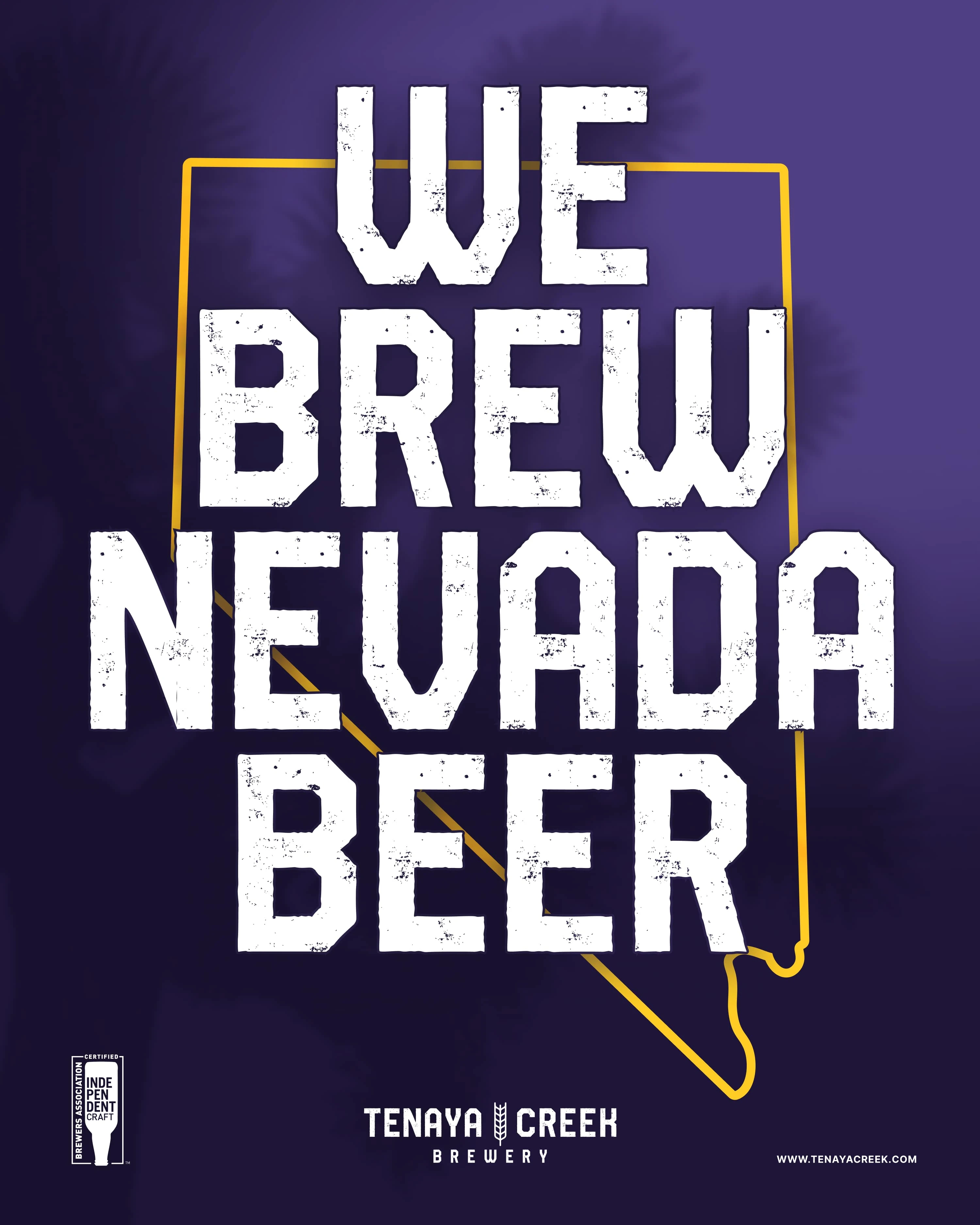
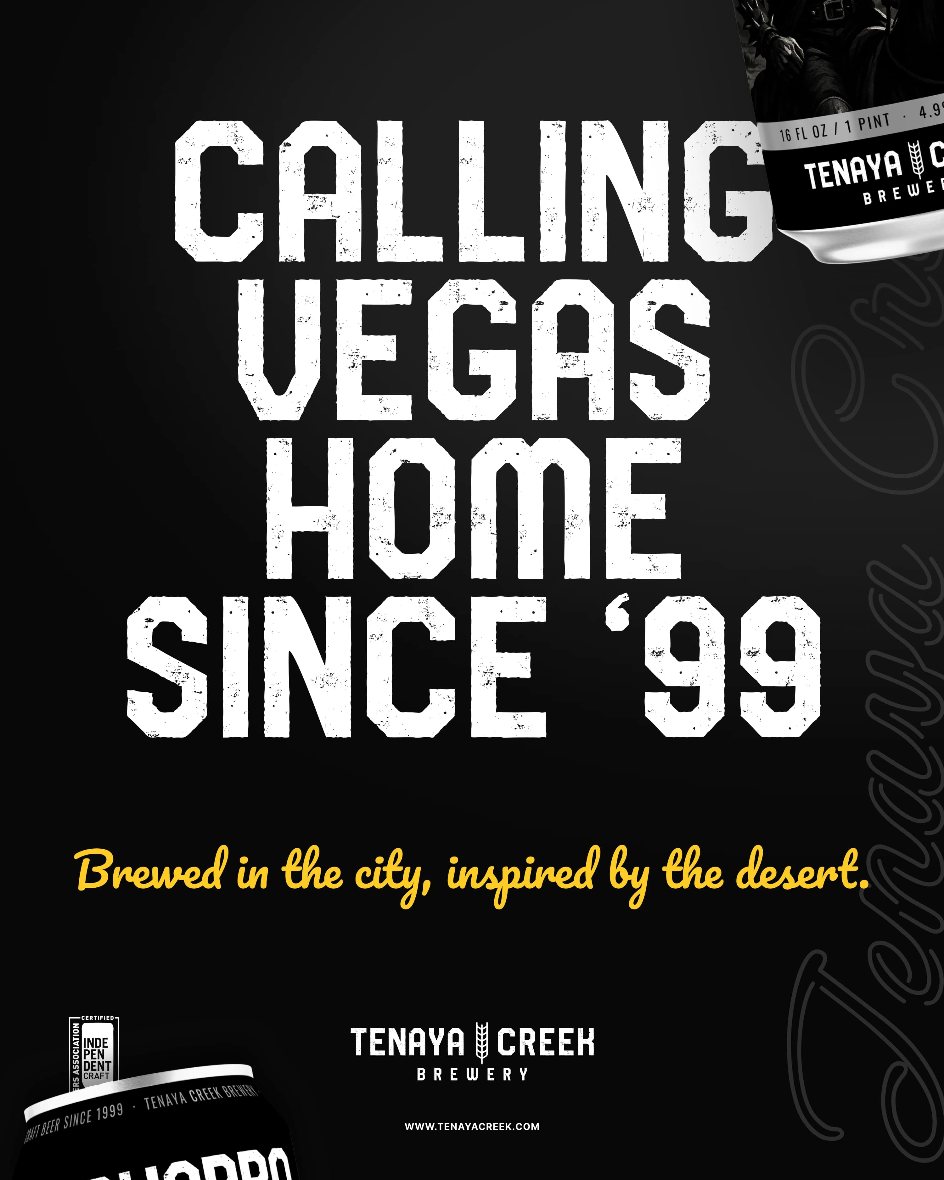
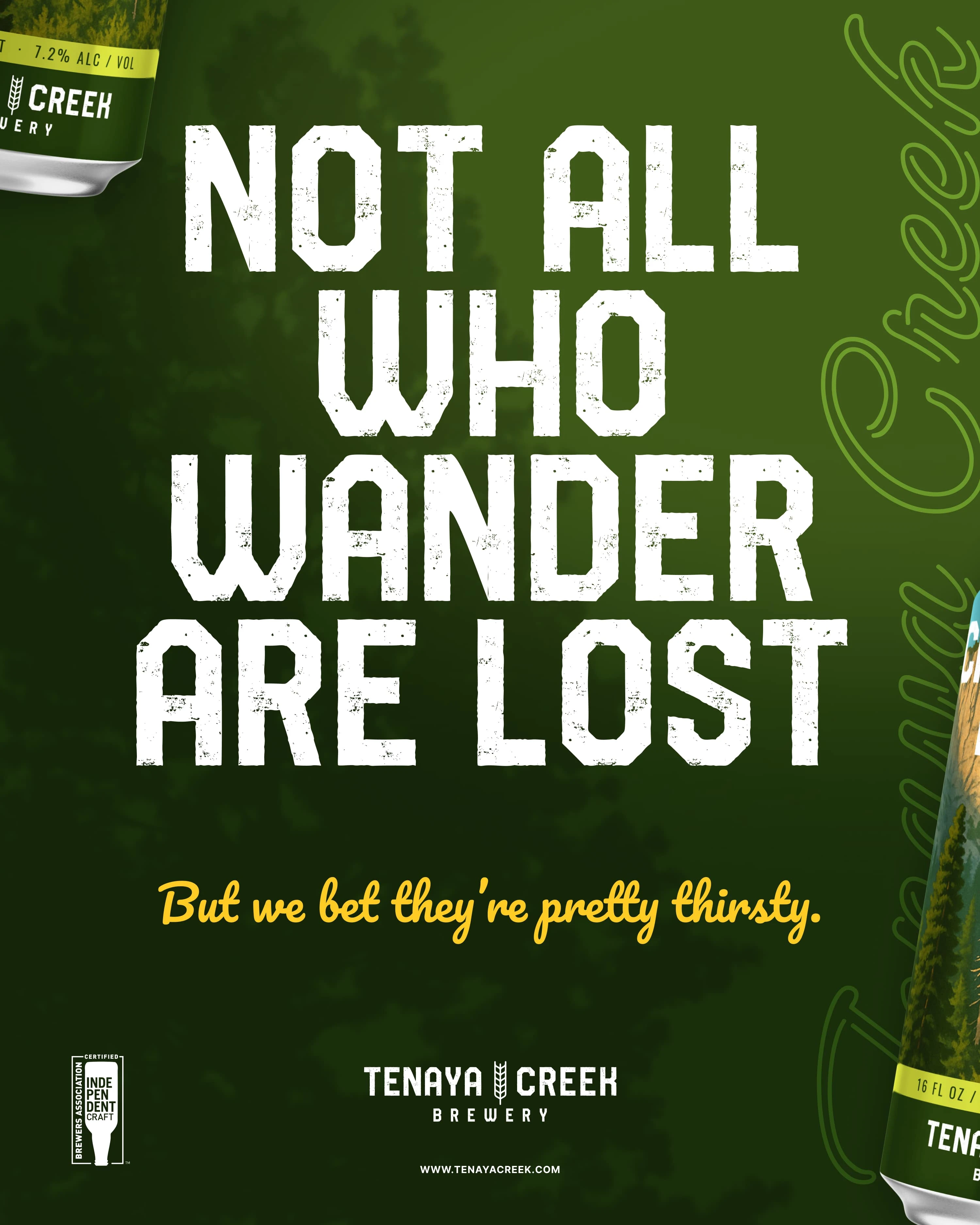
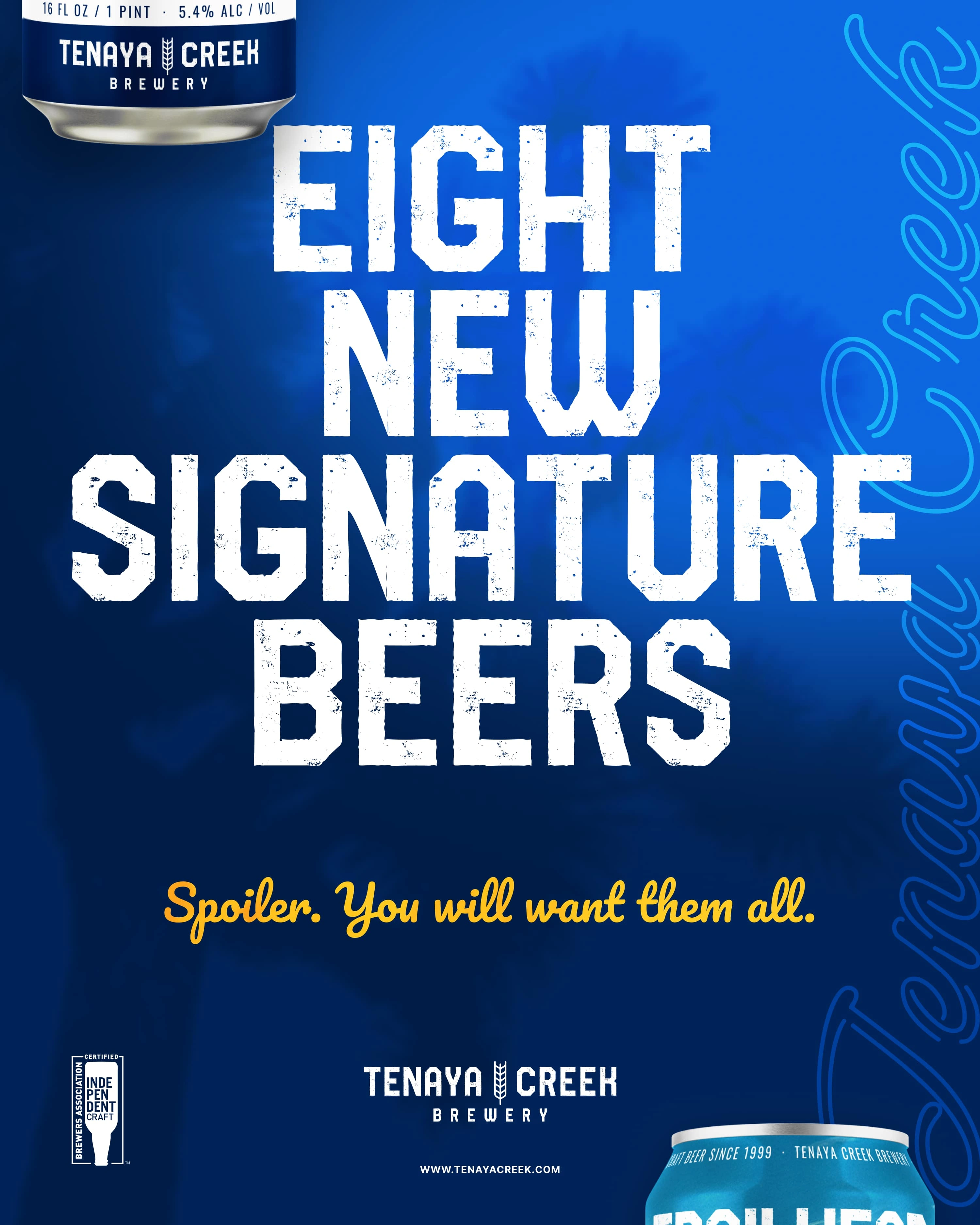
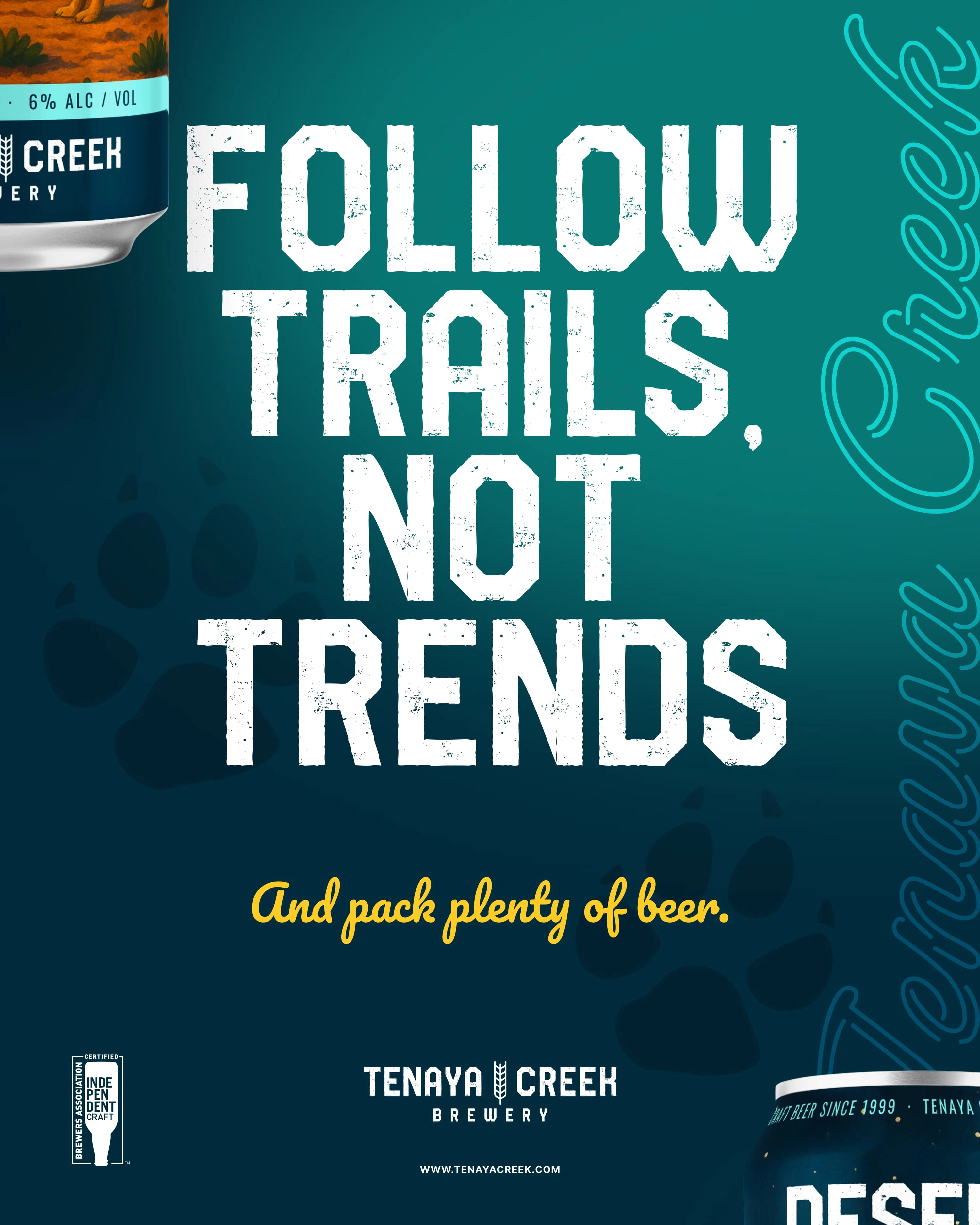
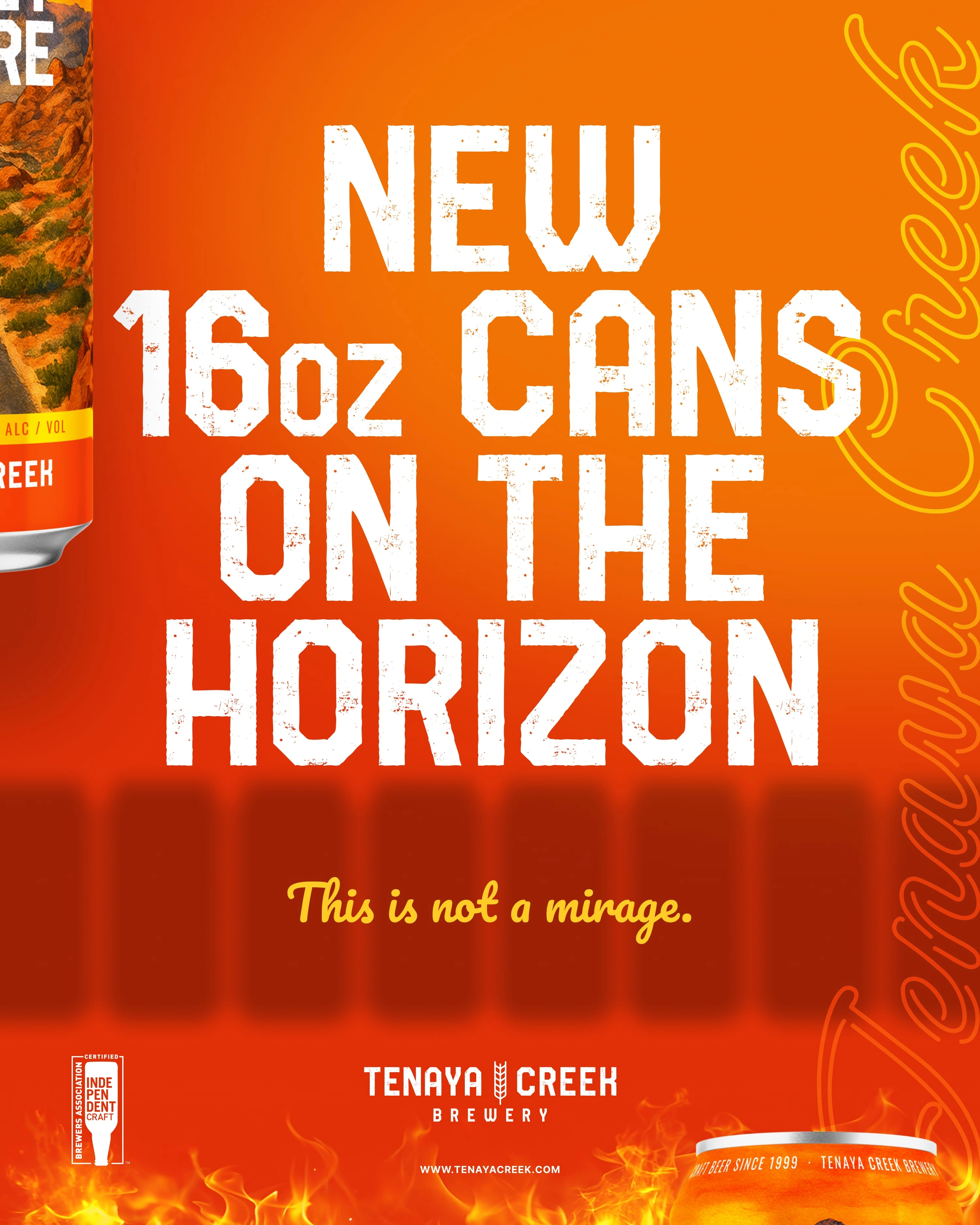
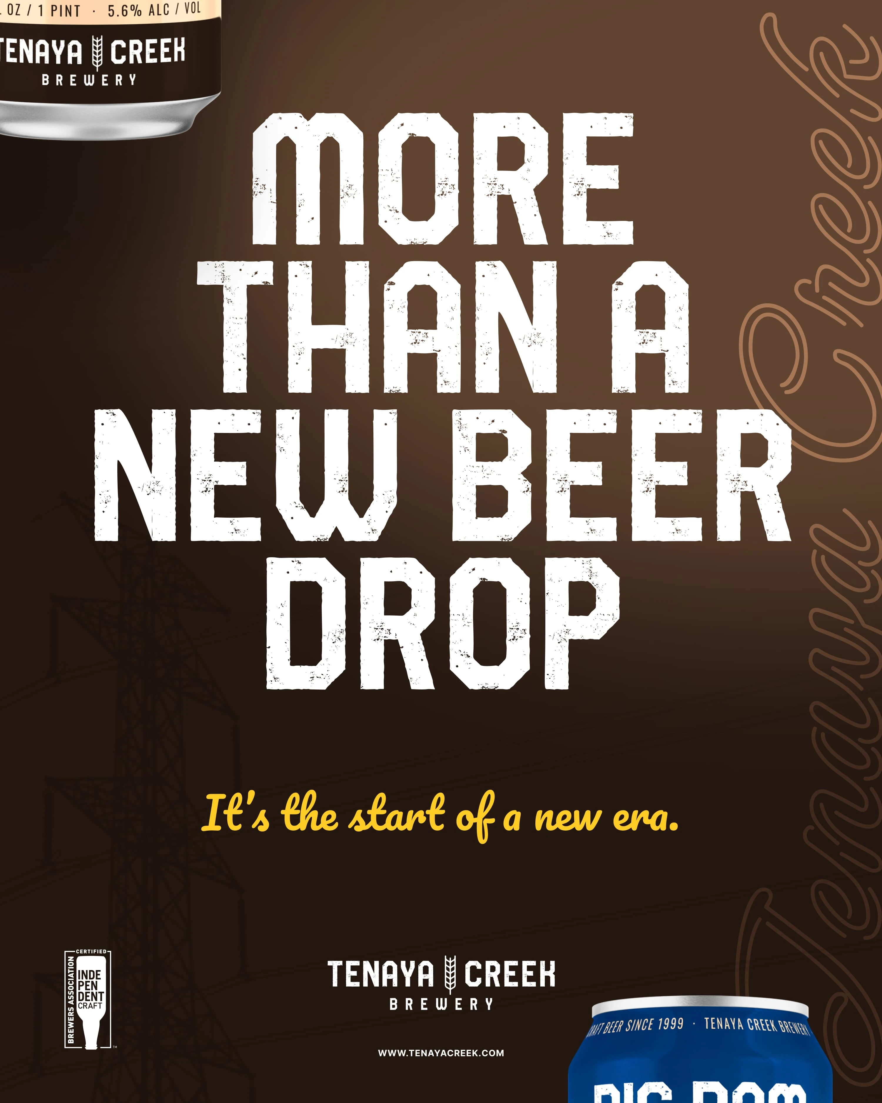
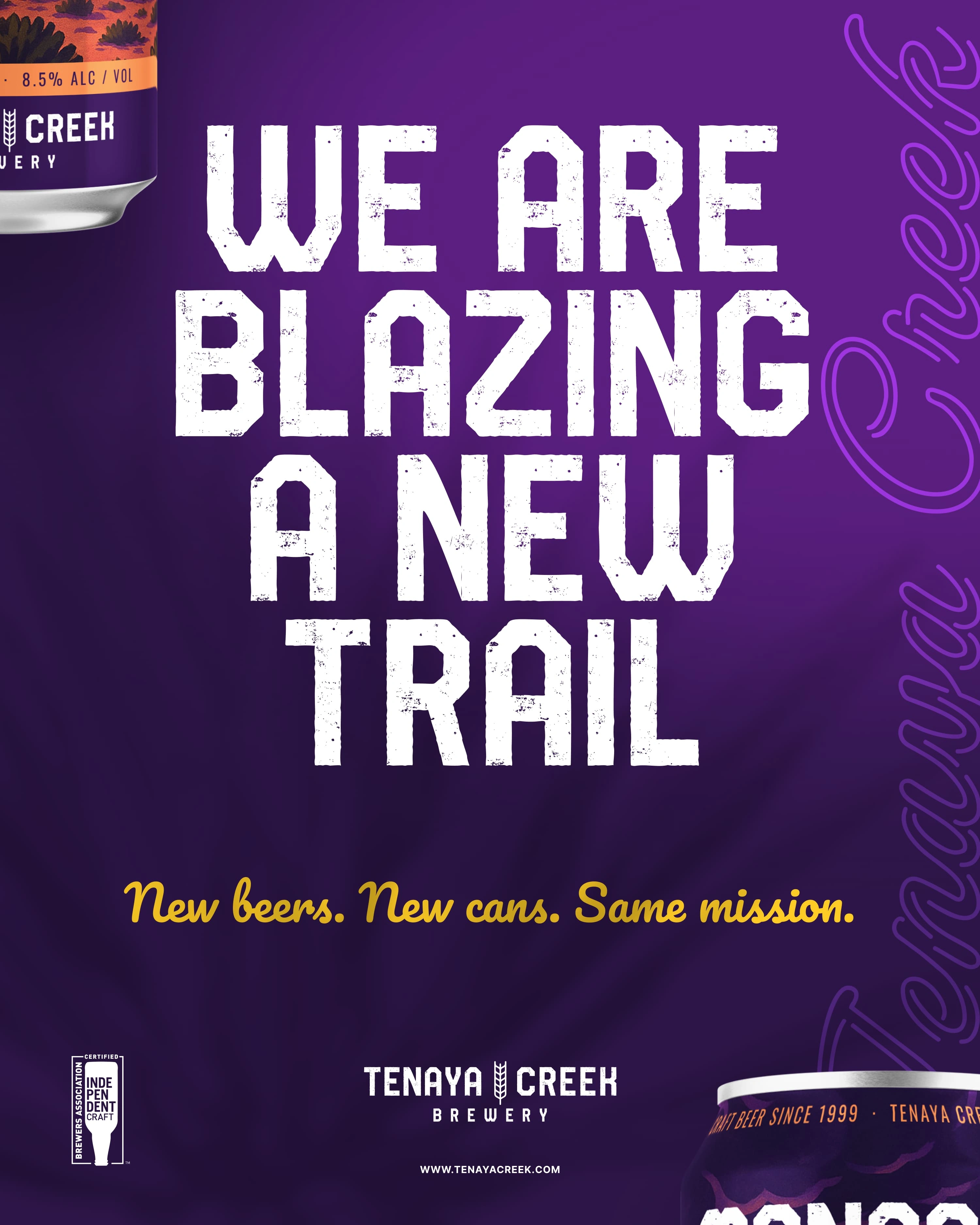
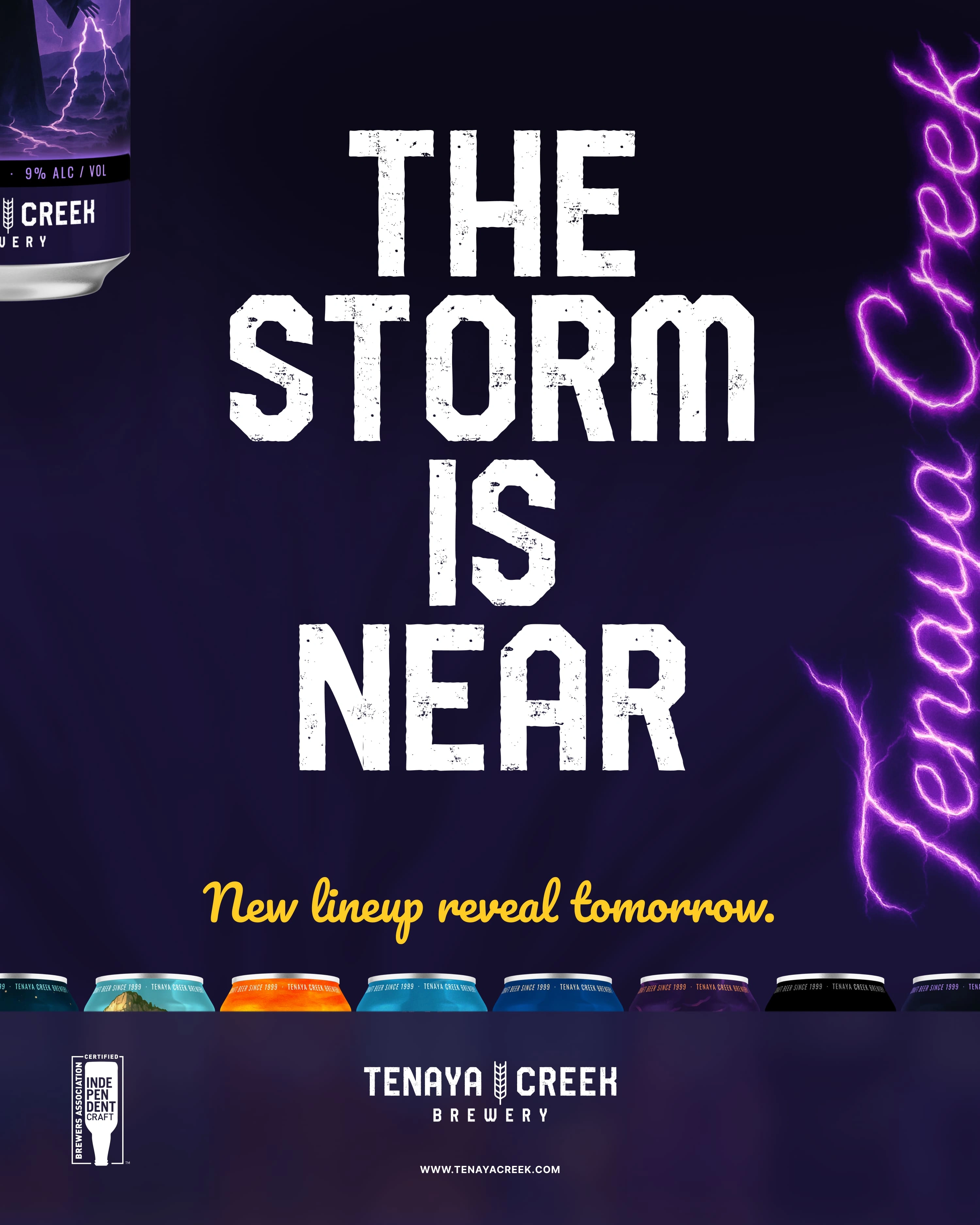
The campaign connects the packaging to the brewery’s Las Vegas roots. Direct headlines, familiar scenery, and individual beer stories give the collection a voice beyond the label.
The artwork introduces the range, highlights specific beers, and connects the brand to outdoor life and local traditions.
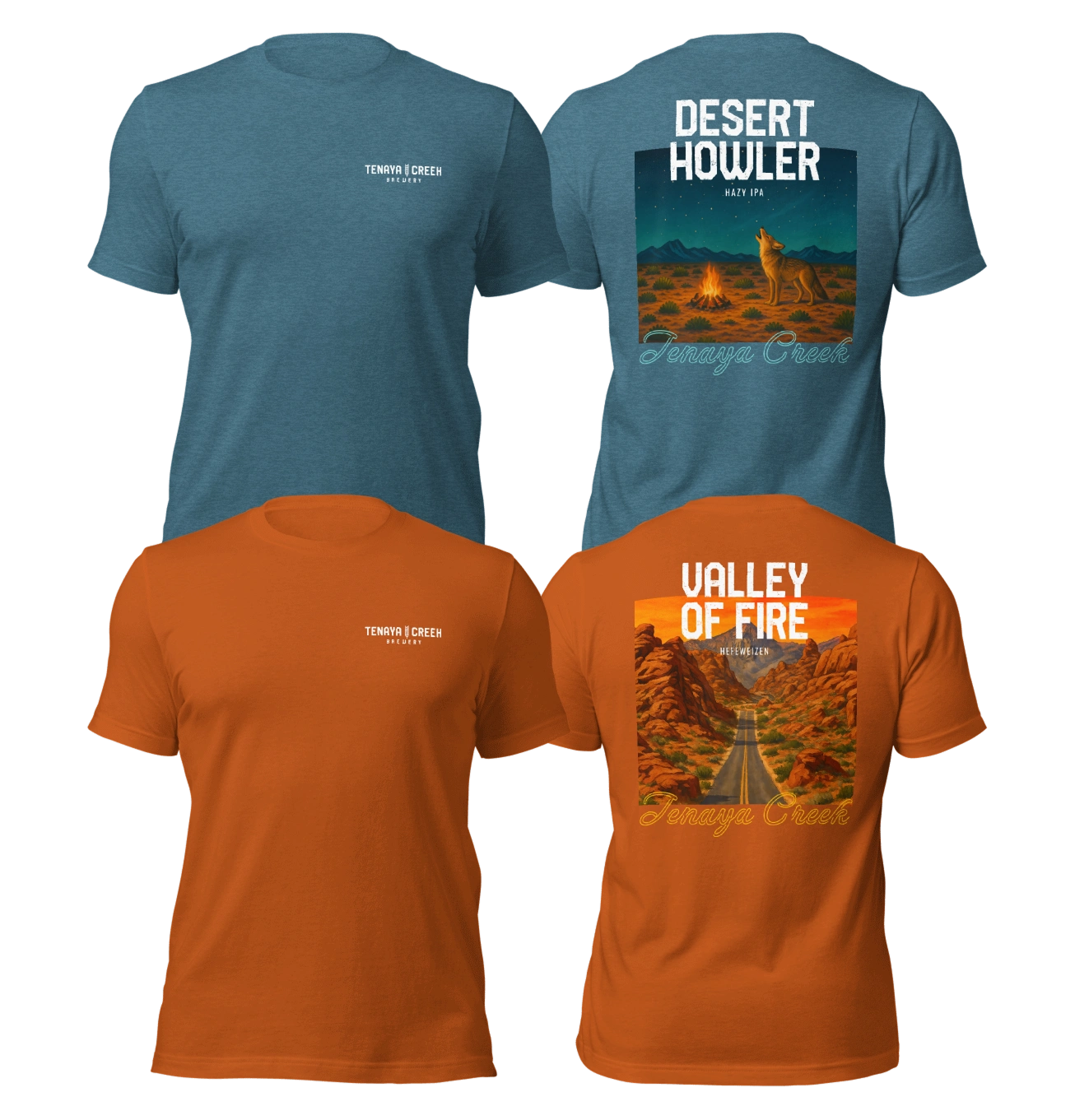
The apparel concepts adapt six beer illustrations for shirts. Each keeps the character of its label, showing how the artwork can become something people wear as well as something they find on a can.
The website design uses the beer artwork, landscape imagery, and shared typography to connect the digital presentation to the packaging. The page brings together the beer lineup, brewery story, tap list, and visitor information.
Explore the website design below.
Visit the brewery website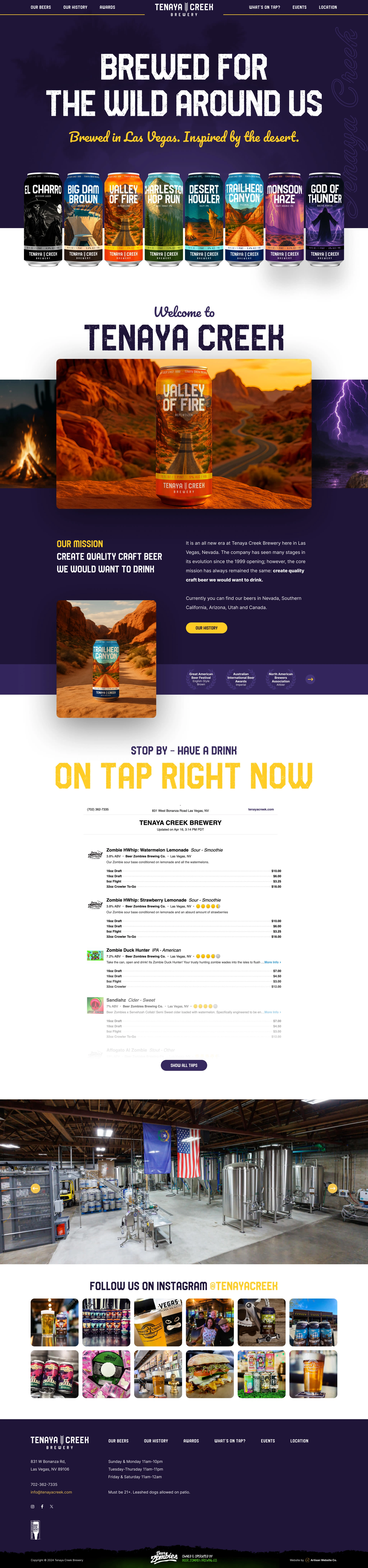
Creative direction, brand strategy, beer naming, identity & can design: Zack Bujazia.
Project applications shown across packaging, campaign artwork, apparel concepts, and website design.
A clear challenge.
An ambitious idea.
Let’s see where it can go.